


Friday, October 30, 2009
Art Collection & Mockup Examples
Pictured below are more examples of art collections that art director Joanne Fink of Lakeside Design has generously shared of artist Mary Gartner's Snow Flurry, Sweet Easter, and Valentine art collections. These collections illustrate that collections can be successful collections even if they are composed of a limited number of some elements (central images, patterns, borders, icons). For instance, the Snow Flurry and Valentine collections each have MANY central images but the Sweet Easter collection only has one. Yet, the Sweet Easter collection is still a successful collection because it has many icons related to the central image that can be used for patterns and borders. The Snow Flurry collection doesn't have many borders but because it has many central figures, more borders can be created if needed. Learn more about art collections by reading "What are Art Collections and Why Create Them?" To see more collections and product mock-ups, go to the "Art Collections / Mockups" section of this blog.


Wednesday, October 28, 2009
Can an Artist be Successful in Licensing Multiple Art Styles?
I've often questioned the possibility of successfully licensing art when the artist has several styles. Some art licensing experts recommend that when the artist first starts out they can try licensing different styles and then choose the one that clicks with the consumer and discontinue the ones that do not work. Other experts recommend that the artist should choose one style from the beginning and stick with it no matter what. But what about licensing multiple art styles at the same time? Read the following comments from art agent Suzanne Cruise.


Licensing Multiple Art Styles
by Suzanne Cruise
I have seen a lot of portfolios over the years, many of them from artists who offer different styles. Most of the time I find that very few artists have SOLID multiple styles. My artist Sandi Gore Evans was one of the fortunate ones. She did those wonderful whimsical characters and then then she created those beautiful (almost botanical) florals. People are often shocked when they learn that the work was done by one artist.
What gave her work away (that the same artist created both styles) was her color palette. Sandi only used six colors of paint so all her work had a similar feel when the styles were viewed next to each other.
Many artists think that they are strong in 2-3-4 styles but realistically they are not. If an artist is truly blessed, then I would say devote time to all the styles and go for it. But artists need to be brutally honest with themselves about their work, and many are not . . . or cannot be. As human nature has it, it is quite difficult to be unbiased about what we do, especially when artists are first starting out. This is where a creative "sounding board " is critical. Ask a person in the business who you trust implicitly, what do they think of all your styles. Then take to heart what they say without getting your feelings hurt. It is a total waste of your creative time to fall in love with a style that you do not do well.
Whether you are really top notch at more than one style or only great at one, always ask yourself how you feel about your work and what part of yourself you are putting into it while you are creating it. If you are painting from your heart, this just shines thru and the art "sings from the page." Many times those artists that paint from their hearts have a leg-up in getting their art licensed as often times, the consumer "connects" with that energy. Work with this "on the page" excitement because it has some innate ability to capture the consumer's attention.
Monday, October 26, 2009
Resource: Facebook - not Just for Individuals

Facebook is not only being used by individuals to keep in touch with family and friends or artists to market their art. It is also used by companies and manufacturers including some that license art. Companies have discovered that keeping in touch with their customers, finding out what they want, and listening & responding to their complaints are ways to create consumer confidence and loyalty. Not only do manufacturers like Harley-Davidson Motor Company and chain stores like Sears have facebook pages but so do manufacturers that license art such as C.R. Gibson, Yankee Candle Company, and Clothworks fabrics. You might ask, "So what?" Well, by reading their pages you will discover new product introductions, consumer response to new products, learn consumer concerns and you can even leave your own comments on their walls. This is a terrific way to learn consumers needs and art trends that can help you to license your art.
When you are in the "Pages" area of facebook, enter a company name in the search window to see if they have a facebook page or enter keywords. For instance, if you search for the word "fabrics," a list of over 200 companies pops-up. Some of them are artists, some retail stores (Hancock Fabrics, Beverly fabrics), and some manufacturers. Hint: It is easier finding manufacturers if you look at only the "Product" and "Other Business" Type as you scan the list.
You must belong to facebook (free) to search for manufacturer pages.
Friday, October 23, 2009
Photoshop Tip: Mockups - A Simple Method to Create Realistic Bedroom Linens & Curtains
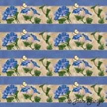
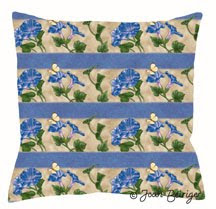
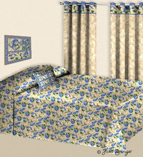 If you want to WOW manufacturers and really showcase your art with mock-ups for bedroom linens and curtains, you can easily do it in Photoshop. The key is to use templates that have realistic shading and then blending the art (pattern) layer with the template layer by using Photoshop's layer modes. The curtain, bedspread, and pillow example at the left was created by using this technique. The most time consuming part of the process is creating the templates. I made mine by taking pictures of actual products, simplifying them (removed patterns and backgrounds) and converting them to gray scale in Photoshop. Spending the time to create templates is worth the effort because they can be used over and over again. This tutorial shows how to create a pillow mock-up with one of my morning glory patterns.
 Warning: If product mock-ups are too realistic looking,manufacturers may think that the art on them have already been licensed. To avoid confusion, I recommend that you use signage stating that the art is available for licensing.
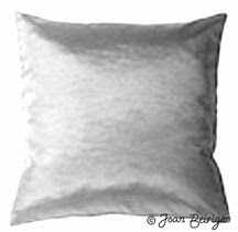
 4. Go to the pattern layer and hit the delete key. The pattern is now in the shape of the pillow.
1. Create a shaded pillow template by either taking a picture of a generic pillow or drawing & shading one. Then open Photoshop and place the pillow template on a layer.
2. Place the art (pattern) in a separate layer above the pillow template layer. Move and/or resize the pattern so that it covers the pillow template.
3. Go to the pillow template layer and select the outside of the pillow with the magic wand tool (Mac & Windows = W).
4. Go to the pattern layer and hit the delete key. The pattern is now in the shape of the pillow.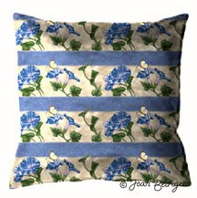
5. Select the multiply mode by pulling down the pop-up menu at the top of the layers pallet. Voila! You now have a realistic looking pillow. Simple isn't it?
Note: If the pillow is too dark, merge the two layers together, and use the Curves Tool (Mac = Command + M; Windows = Ctrl + M) to lighten it.
Wednesday, October 21, 2009
Editorial: Color Trend that Will Stay Around Awhile

When Sears introduced their brilliant red and orange colored washing and drying machines several years ago, I thought "Oh, no the sixties and seventies are back again." I didn't think appliances in these colors would sell or last. Well I guess consumers do like NONE white, metallic and black appliances because Sears and other retail stores are still selling brightly colored washers and dryers. In fact, manufacturers have branched out into all kinds of brightly colored appliances for the kitchen (refrigerators, stoves, food processors,etc.) which ultimately influences the color of the decor. Because many of these are high ticket items, they will not be replaced soon and thus the colors of the decor will stay longer than the norm.
Recently brightly colored furniture have invaded family and living rooms. Read "High Point Market: No longer a sea of brown" where brightly colored furniture seems to be selling well. And I can envision brightly colored furniture spreading also into the bedroom. Artists, you better dig out your sixties/seventies color pallet because I think that consumers will soon be clamoring for art and art on products that compliment their brightly colored appliances and furniture!
Monday, October 19, 2009
Illustrator Tip: Mockups - Creating Unique 3D Product Shapes
 By using Adobe Illustrator 3D effects, you can create your own unique product shapes, map your art onto the surface and rotated the shape and art to any position you wish. This tutorial shows you how to create complex shapes for a vase, a bowl, and a cocktail glass. Before following this tutorial, I suggest that you first read "Illustrator Tip: Mockups (Step 1) - Creating Simple 3D Objects" so that you know the basics in creating 3D objects. Also read "Illustrator Tip: Mockups (Step 2) - Placing Art onto 3D objects" because mapping art onto 3D objects is not covered in this tutorial. Once you understand the concept in creating complicated product shapes, you'll be able to make an endless variety of product objects to showcase your art.
Warning: Product mock-ups can look realistic when art is placed on 3D objects. If they are too realistic looking, mock-ups may look like actual products and manufacturers may think that the art on them have already been licensed. To avoid confusion, I recommend that you use signage stating that the art is available for licensing when you use realistic looking mock-ups in marketing materials.
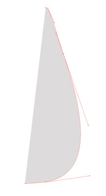
Basic Shape for a Vase
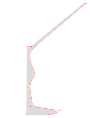
The first step in creating a complex 3D object is to create half of the shape's side view by using the pen tool (Mac & windows = P). Note: I recommend that you do not use the brush or pencil tool to create the shape because they lay down too many anchor and beizer handles which makes the shape bumpy. It also takes longer to render the shape into a 3D object if there are too many points. Using the pen tool can be tricky and frustrating at first. If you don't know how to use it, view a tutorial on youtube.com to learn the principles in using the pen tool.
The example at the left shows that I used a minimum number of anchor points and beizer handles to define the shape and that I did NOT close the path. In other words, the last point at the top of the shape and at the bottom of the shape are not joined together. This is important in creating 3D objects. Also notice that I did not draw a path all the way across the top of the shape. The reason is create a hole in the middle of the vase. Although, if you look down the hole, it will not be straight but a wedge. Drawing only the outside is a fast method when you do not need to see the inside of the shape. I also did not place a beizer handle in the middle of the curve. It is easier to get a smoother curve that way.
Choose a fill color in the color menu at the bottom of the tool bar but don't choose an outline color. I chose a light grey for all the examples.
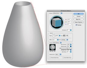
The second step is to click on the shape to select it. Then go to Effect on the Menu bar (at the top of the monitor) and select 3D Revolve. The 3D Revolve Options window pops up. Select the preview button so that you can see the shape as a 3D object and make any adjustments you wish. Note: It is best to experiment with the different adjustments so that you become familiar on how they affect the position and shading of the object.

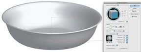
Basic Shape for a Bowl
You essentially do the same steps as were done in the above example but creating a shape for a bowl is more complicated than for the vase. Because you can see the inside of the bowl, you need to draw essentially the thickness of the bowl. Notice that I did not close the path between the upper and lower points on the left side of the shape. Below is what the bowl shape looks like once the 3D Revolve effect is applied.
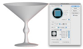
Basic Shape for a Cocktail Glass
A shape for a cocktail glass is a little more complicated to draw than the other examples. However, the same principal and steps apply. And once again I did not close the path between the inside and base of the glass. Below is what the glass shape looks like once the 3D Revolve effect is applied.
Saturday, October 17, 2009
The Dynamic Duo #2 - Examples of Art Collections & Mockups
Pictured below is another series of collections and product mock-ups that art director Joanne Fink of Lakeside Design has generously shared of artist Mary Gartner's art - Jolly Joy ( three 8-1/2 x 11 inch sheets of collections and three sheets of product mock-ups) and Santa's Visit (two sheets of collections and two sheets of product mock-ups). Notice that these two collection have scads of icons that made it possible for Mary to create a huge variety of product mock-ups such as wraps, note pads, list pads, pencils, tags, seals, stickers, gift bags, magnets, cards, boxes, etc. Also notice that the mock-ups for the Jolly Joy collection have been created so that they go together as a complete product line and that Mary even included a mock-up of the product packaging (shown on the right hand side on the third picture).


To see more examples of art collections & mock-ups, and also tutorials on how to create them go to Art Collections / Mockups section of this blog for articles on collections and mock-ups.
Jolly Joy Collection and Product Mock-ups created by Mary Gartner
Santa's Visit Collection and Product Mock-ups created by Mary Gartner
Thursday, October 15, 2009
Photoshop Tip - Using Photoshop to Shade Art and Mockups
There are MANY ways that you can shade art and mock-ups in Adobe Photoshop. You can shade them by using the Inner Shadow & Inner Glow layer effects, by using the Dodge & Burn tools, by using the Lighting effect in the Render filter, by purchasing plug-in software, or by shading/painting manually with the Brush tool. The examples below illustrate these methods. Note: They were created quickly and probably better results could have been achieved if more time was spent on them. What method to use depends on what effect you want and whether it is used for art or product mock-ups. Read my comments next to each method for details.
 The basic red circle for all the examples shown below was created using the Elliptical Marquee tool (Mac & Window = M) and filled with red with the paint bucket tool (Mac & Windows = G). I chose the color red because it is one of the most difficult colors to show shading and therefore reveals how well the different methods shade an object.

Using the Inner Shadow & Inner Glow effects in the layer menu. This method applies the effect automatically to the entire layer and the light spot is always centered. I don't think it is a good method for shading art but it is an easy method for shading some product mock-ups such as pillows and oven mitts.


The basic red circle for all the examples shown below was created using the Elliptical Marquee tool (Mac & Window = M) and filled with red with the paint bucket tool (Mac & Windows = G). I chose the color red because it is one of the most difficult colors to show shading and therefore reveals how well the different methods shade an object.Using the Inner Shadow & Inner Glow effects in the layer menu. This method applies the effect automatically to the entire layer and the light spot is always centered. I don't think it is a good method for shading art but it is an easy method for shading some product mock-ups such as pillows and oven mitts.
Do the following steps to use the Inner Shadow & Inner Glow effects:
1. Select the layer that you wish to shade and use the Inner Shadow effect in the Layer Style command. Do this by selecting the "fx" button at the bottom of the Layers palette and choose the Inner Shadow effect from the pull down menu. I used the following settings for the example. Structure: blend = multiply; select dark red color by double clicking on black box; opacity = 94%; angle = 120; distance 53 px; choke = 0; size = 237 px; quality = default settings.
2. Use the Inner Glow effect in the Layer Style command. Select the "fx" button at the bottom of the Layers palette and choose the Inner Glow effect from the pull down menu. I used the following settings for the example.
Structure: blend = screen; opacity = 36%; noise = 15%; select light red color by double clicking on black box; elements source = center; choke = 46%; size = 250 px; quality = default settings.
Using the Dodge (lighten) and Burn (darken) tools. By using this method you can lighten or darken any portion of the art on each layer. These tools are used by many Photoshop artists to shade their digitally created art. What I do not like about these tools are the colors used in doing the shading. Instead of using a lighter or darker hue of the color to be shaded, the Dodge tool uses white to lighten the color and the Burn tool uses black. It may look fine for some colors but I don't like the effect for darker colors like red.
Do the following to use the Dodge and Burn tools. Choose the Dodge or Burn tool from the tool bar or press the letter O on the keyboard. Rotate through the tools in that section (Dodge, Burn, Sponge) by holding down the shift key and clicking on the letter O key. Select the brush style, range (shadows, midtones, highlights), and exposure options that is located on the option bar (Mac = across the top of the window). Then shade the art or mock-up with the selected tool.
Using the Lighting Effects in the Render filter. This method applies the effect automatically to the entire layer. I find this a difficult method to use because the shading effects that you see in the Lighting Effects window are not the same once you leave the window. Therefore, I rarely use this method for shading.
Do the following to use the Lightening Effects in the Render filter. Go to the Filter command. Then select Render and then Lighting Effects in the pull down menus. In the Lighting Effects window, select omni for the light type and adjust the handles on the light source to get the effect you want. Adjust the setting to get the effect you wish. I used the following settings: intensity = 0; gross = -17; materual = 58; exposure = -31; ambience = 23 for the example at the left.
Using Mystical Lighting (plug-in filter software) from Auto FX (purchase price = $179). This plug-in allows you to apply 16 visual lighting and shading effects to your art and mock-ups. Applying the effects to any area on the layer is easy. However, I recommend watching the tutorials because the software is not very intuitive. A drawback to the software is that it is slow in rendering the effect in the Mystical Lighting window and returning to the Photoshop window. Even so, I still use this method of shading art and mock-ups because the gradiations of colors produce realistic shading.
Using the Brush tool (Mac & Windows = B) by manually shading shapes. Not surprisingly this method makes the shape appear the most round of all the Photoshop methods. But it takes the most time because you need to constantly change the color hue to achieve the correct shading of the shape. I think this works well if you are painting your art digitally but is too much trouble if you want to give depth to product mock-ups that have many colors. In the example at the left, I used a progressively lighter red hue with a lesser amount of opacity as I used the Brush tool to paint toward the light spot on the object.
Tuesday, October 13, 2009
Questions to Ask Before Choosing An Art Licensing Agent

When choosing an agent to represent you in licensing your art, there are many things to consider. For instance, is the potential agent passionate about your art and really wants to represent you, do you and the agent see eye-to-eye on marketing your art, and do you agree with the terms of the agent/artist contract. Of course, there are many other considerations and each artist has different needs so what may work for one may not work for another artist. Below are comments paraphrased from Suzanne Cruise of Suzanne Cruise Creative Service, Inc. in response to questions asked by members belonging to the Art of Licensing yahoo forum.
What is the initial length of time an agent represents an artist? The normal length of time is two to three years. With the economy being what it is and the severe competition for licenses, you have every right to ask for a shorter initial time frame. Even six months is enough to know if you two are a "match made in heaven." I prefer eight months but six is often enough. It is not unusual to take on an artist and have nothing come of it. An agent who finds they are not getting interest/contracts for the work after 6-8 months should be frank with the artist, and if needs be, release them from the 2-3 year contract. This is why I have been suggesting to artists that they negotiate a trial period with an agent as many agents will bind you to them for the entire term, no matter how little they get for you. You might want to ask for some sort of performance clause especially if the agent wants a long initial term. The most realistic way to structure this would be to require the agent to get you x number of agreements in x period of time. It may be difficult to get an agent to agree to this, but it is certainly a bargaining point you can throw out for discussion. Honestly, while there are standard guidelines, there is nothing absolute in licensing. It is whatever two people agree to.
Is it okay to signup with an agent new to licensing? I would definitely give consideration to an agent who may be new to the field because most agents did not start out with years of experience and contacts. I would consider a "new" agent based on their background, history in the field they are coming from, their attitude, business sense, organizational skills and overall enthusiasm, among other things. I always tell artists in my seminars that I found my first blockbuster artist (Sandi Gore Evans) when I had VERY little rep experience under my belt. She was already being courted by several big time agencies and people when I contacted her, but she agreed to meet. In the course of our conversation, her stated concern was that I was "too sophisticated" to appreciate her art (country/folk). We kept talking and found we had a mutual love for Lyle Lovett (among other things) so she signed with me. After I had worked with her awhile, I came to see that the REAL reason she hired me was because she wanted to be a BIG fish in a small pond, and she wanted one more kid to push round (she had four grown children, I was her fifth). I was full of enthusiasm and big dreams when we met, those qualities were what she was looking for. I will be eternally grateful for her vision, her trust and her confidence in what I was to become. Thru her, I cut my teeth in licensing.
Should I choose an agent that represents well known artists? The suggestion to look at which artists are known and who are their agents is a good one, but not fool proof. They may do really well for certain artists, but maybe you go with that person or group (who do very well for a well known) artist(s) and then they bomb for your work. What you would want to be concerned with is that the agent would spend a greater % of their time working the "known" artist, and your work may not get much attention. You would really need to interview them closely to make sure that concern does not become a reality if you sign with that agent. If any agent takes you on and works your library and then has little success, does that make them a bad agent/agency? Not necessarily, because they may not be right for YOUR look. As far as known artists versus unknown artists, there are MANY lesser known artists out there who are HUGELY successful in licensing but their names are known only to the buyers and their customers (where it really counts) but the artist may not be well known in some of the art circles. Getting a "name" in licensing is some what secondary to me as opposed to making good money. I have seen it happen many times where you make good money first, and in the process your name gets more and more out there (by virtue of it being on every single product it is licensed to) until you find you ARE well known.
What should I ask an agent? Having given many seminars on this subject, there are quite a few questions to ask a potential agent.
1. How long have they been in business and how did they come to do this line of work? What is their agenting philosophy? This one question may hold all the keys you need to this relationship.
2. Who do they represent?
3. What companies/categories are the artists licensed to? Do they specialize in certain categories? What ones are they not licensed into?
4. How many artists are in their group?
5. How long have they represented these artists?
6. How many other reps do they work with (or who work for them) and how are the artists divided (which rep gets who)?
7. Ask to see their contract, both Artist/Agent and Licensor/Licensee. Have an attorney ( or another agent you trust who knows contracts) advise you as to what the contract really says as to what you are legally committing to. This is worth EVERY PENNEY they charge.
8. What is their money/ percentage split?
9. Who pays for what? What creative services do they offer and what is the charge for these? How will they represent you?
10. Do they exhibit at any shows? Do they walk any shows? Which ones?
11. Do they personally call on the individual manufacturers? Name a few and how often do they do one- on-one?
12. Ask them for referrals - both from the artists as well as the manufacturers. AND CALL EACH ONE OF THEM!!!! Get artists' phone #'s they rep (more than 1 or 2) AND get manufacturers names and numbers who they work with. When you call the manufacturer, in addition to the questions you will ask about your potential agent. Be sure to ask them if they work with any other agents and what they think of them and how thy work. These referrals/references are probably going to come from word of mouth as an individual is vulnerable to getting a lawsuit for slander if they put their real opinion in print.
Trust your guts on this decision. If you don't have warm, fuzzy Hallmark feelings about that agent, walk away from the deal.
Monday, October 12, 2009
Inspiration from Artists

I find that learning how other artists get started in creating/licensing their art and the journey in achieving their goals are very inspiring. All have different backgrounds, schooling and training. The journeys are often long and the routes different. But one thing in common that they do have is they do not give up when the going gets tough.
Both Kate Harper and Jen Goode have posted great artist interviews on their blogs. Read about what inspires various artists, what they like most, what is the easiest/hardest part in licensing their art, and their advice to other artists. You will see that you are not alone in your quest to license art.
Friday, October 9, 2009
Resource: Legal Information for Artists & Photographers

Artists MUST know all about their legal rights and the legal do's-and-don'ts when they enter into the art/photography licensing business. Attorney Joshua Kaufman of Venable LLP has written an impressive number of articles dealing with all aspects of art, photography, copyright and licensing issues. Do you want to learn about some of the key elements in a licensing agreement? Read his article "The Legalities of Licensing." Do you want to know how to choose an art lawyer? Read Joshua's article "How to Choose an Art Lawyer." Do you want to know why you should register your art with the Library of Congress? Read "Registering Your Copyright." Want to read an interesting article about a case history of what happens when someone steals your art and you have an attorney on your side? Read "Anatomy of a Copyright Infringement Case." These are just a few titles of the over 50 articles that Joshua has written. They are must reads if you are in the licensing business.
Another source of legal information is on attorney Elizabeth Russell's blog. Read "Resouce: Legal Information Blog" to find out more.
Wednesday, October 7, 2009
Art Collection Examples
Pictured are more examples of art collections that art director Joanne Fink of Lakeside Design has generously shared of artist Mary Gartner's Witch Bootique, Easter Traditions, and Nautical art collections. All of these collections are composed of central images, patterns, borders, icons, and art formatted in several ways. They are ready to be used on all sorts of products. Learn more about art collections by reading "What are Art Collections and Why Create Them?" To see more collections with associated product mock-ups, go to "The Dynamic Duo #1 - Examples of Art Collections & Mockups."


Monday, October 5, 2009
Illustrator Tip: Mockups (Step 2) - Placing Art onto 3D Objects
 In this tutorial, I will show how to place art onto 3D objects that have been created in Adobe Illustrator. If you do not know how to create 3D objects, read "Illustrator Tip: Mockups (Step 1) - Creating Simple 3D Objects" to learn how to create them. Warning: Product mock-ups can look realistic when art is placed on 3D objects. If they are too realistic looking, mock-ups may look like actual products and manufacturers may think that the art on them have already been licensed. To avoid confusion, I recommend that you use signage stating that the art is available for licensing when using realistic looking mock-ups in marketing materials.
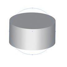 1. Open an Illustrator file of an already created 3D object. This tutorial shows an example of a 3D round shaped object (for a box/tin mock-up) for art to be placed (mapped) onto the top and side. I used the ellipse tool in Illustrator and applied the 3D effect to create the object at the left.
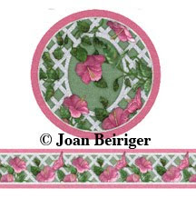
2. In this tutorial, I will use my hibiscus floral art at high resolution (300 dpi) and created in a round shape for the top of the object and in a border for the side.
3. Make a new layer and either drag the round art from an opened Adobe Photoshop file, an Adobe Illustrator file, or use the place command in Illustrator to put the art on the layer. Do the same for the border art. Note: The border art should be long enough to go at least half way around the circumference of the object. When you rotate the 3D object, you want the art to "appear" to cover the entire circumference. I used a 1-1/2 by 18 inches border for this tutorial and it was too long.
4 The art has to be a symbol in Illustrator to place the art onto the object. To make art a symbol select one of the art pieces, open the Symbols Panel (Mac = shift + command + F11; Windows = shift + Cntl + F11), click the New Symbol button. Name the symbol and select the type of symbol as graphic. Press okay and the art will appear in the Symbols Panel. Do the same for the other piece of art.
5. Go to the layer that has the object on it and select the object. In the Appearance window (shift + F6), double click 3D extrude and bevel to open the window. Click on Preview so that the object looks 3D (if it does not) and click on Map Art. The Map Art window opens.
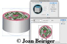
6. In the Map Art window, make sure the top surface is selected in the Surface slider bar. Click Preview and select the round art from the Symbol pull down. Click on the "Scale to fit" button at the bottom of the window.
7. Select the side of the object from the Surface slider bar and then select the border art from the Symbol pull down. Move the art and adjust the size so that it fills the surface. Click on Shade Artwork and then click Ok to exit the Map Art window.
8. In the 3D Extrude & Bevel Options window you may wish to adjust the rotation of the artwork with the custom rotation box. Also you may need to alter the surface shading. When I did the example, I found that the top of the object was too dark so I moved the light source to the top and then added a second light source to shine on the front side of the object with the Surface ball. When finished, click Ok to exit the 3D Extrude & Bevel Options window.
9. Use the pen tool to make a curved line on the mock-up to simulate the division between the lid and base of the box.

Voila! You now have a mock-up that can be exported as a jpg or another file format so that it can be used in Photoshop for use in creating marketing materials.
Copyright © 2009 Joan Beiriger
Saturday, October 3, 2009
Illustrator Tip: Mockups (Step 1) - Creating Simple 3D Objects
 You can create amazing three dimensional (3D) products in Adobe Illustrator and then place your art onto the surface(s) to make outstanding mock-ups. In Illustrator all kinds of 3D shapes can be created such as bowls, cups, plates, and vases. For more information read "Adobe Illustrator - Creating 3D Product Mockups."
I found that creating 3D objects and placing art on them is easy to do once you know how but explaining it in a tutorial can be quite long. Thus, I am going to do a series of tutorials. This first tutorial will show you how to create simple shapes and convert them into 3D objects. Later tutorials will show you how to place (map) your art onto the surface(s) of the objects and how to create more complex objects. Simple 3D objects can be used for all kinds and shapes such as decorated boxes, gift bags, stationery products (books, notepads), and candles.
View three videos by two different people to help you understand the method in creating 3D objects and make it easier to follow the steps in my tutorial. In fact, watching the videos may be all that you need. But I decided to also include a written step-by-step tutorial for those of you that learn easier that way.
1. Part one video on creating 3D objects.
2. Part two video on creating 3D objects.
3. A video that is a little more detailed in creating 3D objects.
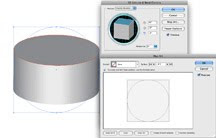
I assume that you know how to use the basic tools and commands in Adobe Illustrator. Use the help package in Illustrator if you don't know how to access some of the tools that I mention. The following shows you how to create a six sided box.
1. Open a new document in Adobe Illustrator. Then open the layer window (Mac = F7 key) and choose a new layer.
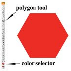
2. Choose a fill color in the color menu at the bottom of the tool bar but don't choose an outline color.
3. Choose the polygon tool on the tool bar. It is in the same pull down menu as the Rectangle Tool (Mac & Windows = M). Note: the default polygon is six sided but you can alter the number of sides by double clicking in the window when the polygon tool is selected. A menu pops up where you can choose the size and number of sides of a polygon.
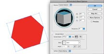
4. To create an object with the polygon shape, click on the shape to select it. Then go to Effect on the Menu bar at the top of the monitor, choose 3D, and then Extrude & Bevel. The 3D Extrude & Bevel Options window pops up for editing the object as viewed at the left.
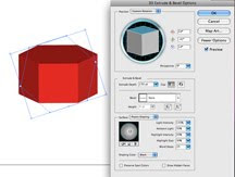
5. Select the preview button in the window so that you can see the shape as a 3D object.
6. You can rotate the object by moving the box in the 3D Extrude & Bevel Options window. To increase or decrease the depth of the object, change the Extrude Depth value. Choose a closed cap to cover the top and bottom of the object or an open cap to show a tube of the object.
7. Click on more options (right side of window) so that you can access the lighting tools. Move the square on the ball to move the lighting source on the object. You can also adjust the intensity, ambient light, intensity, size and blending of the light. More lighting sources can also be added by clicking on the middle icon at the bottom of the lighting window. In my example, I used one lighting source, an extrude depth of 150 pts with no bevel, and a closed cap.
8. When finished, click okay to exit the option window. If you want to later change some of parameters in the 3D Extrude & Bevel Options window, simply select the object and go to the appearance menu (Mac = shift + F6) and select 3D Extrude & Bevel for that window to open. Note: The object can be exported as a jpg or other file formats so that they can be used in Photoshop. However, you may want to wait until your art is placed on the object before exporting the file. Read "Illustrator Tip: Mockups (Step 2) - Placing Art onto 3D Objects" to learn how to create 3D objects
The examples shown in the picture at the top of this article are a variety of objects that can be created in Illustrator by using the polygon, ellipse (oval shape), rounded rectangle, star tools and converting them into objects with the 3D effect. A bevel was applied to the edge of the pink oval while in the 3D Extrude & Bevel options window. To make the objects look like products, I put a line around the green box so that the object looks like it has a lid; put a clip art icon on the pink oval; drew three ovals to simulate pencil holders on top of the blue box and put a pencil clip art icon into one hole; and placed a verticle line on top of the yellow star to simulate a candle wick.
Thursday, October 1, 2009
The Dynamic Duo #1 - Examples of Art Collections & Mockups
My definition of the dynamic duo in art licensing is the creation of art collections and product mock-ups that showcase art themes. Creating both gives artists an advantage in licensing their art. Learn more about art collections by reading "What are Art Collections and Why Create Them?" and about product mock-ups read "What are Product Mockups and Why Create Them?"
Thanks to the generosity of artist / art director Joanne Fink of Lakeside Design, I will be doing a series of posts showing art collections and mock-up examples that Lakeside Design have created. Today's post illustrates that a collection of patterns can not only be used for fabrics, gift wraps, and scrapbooking but also other products.


Below are two 2-page layouts of Joanne Fink's Nordic Christmas collection patterns with greeting card, mug, pillow, and rectangular candle product mock-ups.
Below is a two page layout of Eileen Biedrzycki's Christmas Time collection patterns with giftbag, greeting card, and pillow product mock-ups.
Below is a two page layout of Diana McMackin's Snowflake Elegance
collection patterns with mug, pillow, album cover, note paper, and file box product mock-ups.
Subscribe to:
Posts (Atom)