Christmas is the most profitable time of the year for retailers. Consumers spend more money decorating their homes and gift giving than any other time of the year. Thus, Christmas themed art on products are a huge category in licensing art. And using colors and Christmas motifs that are popular with consumers are important when creating art for products. However, trends that are predicted to be "hot" by trend experts may not be as important. As with all product categories, artists must do their homework in learning which manufacturers follow trends and which ones use traditional designs and color for their products. For instance, manufacturers that license graphic art on greeting cards tend to use more trendy colors and motifs than manufacturers that produce fine art greeting cards. Below are discussions about color, motif, and word trends used in Christmas art.
Color Trends
There are several trend services that predict trends for different product categories. One is The Trend Curve and the international authority on color and design trends in home furnishings. Michelle Lamb the co-founder and editorial director of The Trend Curve attends major trade fairs around the world to help her forecast trends in color, patterns and designs. She predicted that the Christmas color for 2011 would be silver and a light shade of green as stated by Debbie of Fancy House Road blog in "2011 Christmas Decor Trends: Silver and Green." And Interior Holic agrees in "Christmas 2011 Decoration Trends." Most likely Michelle Lamb saw this trend at the spring Frankfurt Germany's huge trade show Christmas World. In fact, these colors are big in the Netherlands according to Marianne Songbird from the Netherlands in "Christmas Decorations Fashion Trends 2011."
But, even if silver and light green are "hot" 2011 Christmas colors in Europe are they in the United States? I sure did not see it THIS year. Some of the articles that I read suggested that retail stores would be decorated with these colors. I do not remember the decorations at most department stores but Kohl's used red and gold. And you would expect that store window displays in New York would follow color trends. But the colors used in the store fronts varied depending on the theme displayed and products shown. View "Christmas in New York 2011" to see fabulous window displays. Look at the side bar on the website to select various department store window displays.
So just because a trend expert predict certain colors to be "hot" for Christmas does not mean manufacturers and retail stores follow them or can even implement that year's predicted trends because of the long lead time in their production schedule. Also most consumers cannot afford or wish to redo totally their Christmas decorations each year just to have the trendy Christmas colors in their homes. Perhaps Margery Stewart Baxter of Pro Flowers in "2011 Christmas Decorating Trends You Want to Know About" best states the use of trendy colors. ". . . A trend does not make a mandate. Stores are happy to satisfy Christmas shoppers of all styles, even the markedly "untrendy." And Beverly Fabrics blog proves that in "2011 Christmas Trends" because they show an array of Christmas decorating options and colors that should satisfy every consumer.
Motif Trends
When searching the internet, I could not find any articles about trends for Christmas motifs. So I used the old standby and looked at Christmas products in retail and internet stores. Popular motifs seemed to be the ubiquitous Santa, snowman, reindeer, poinsettia, holly, candy cane, pine cone, cardinal bird, and snowflake. Also used were Christmas trees, gingerbread men, polar bears, penguins, ornaments, stockings, mittens, wreaths, and various birds and flowers. None of these motifs are new and have been appearing on Christmas art for years.
Word Trends
As with a lot of art on products in todays market, Christmas art often incorporates words of hope and good feelings such as love, joy, celebrate, hope, and cheer. In recent years, the words "Merry Christmas" has been replaced with "Happy Holidays" on much of the art. This change is an attempt to make products appeal to a broader spectrum of consumers. America has become more religiously diverse and many non-Christian religions also celebrate around the end of the year. By using a more generic term such as Happy Holidays, products appeal to consumers that do not belong to a religion, belong to a non-Christian religion, or belong to a Christian religion.
Should artists follow trends?
While it is important for an artist to be aware of the current trends in Christmas art, they may choose not to use them in their art. Using or not using trends depends on the art style and product. For instance, if art is created for the decorative flag industry, the predicted 2011 Christmas colors of silver and light green is not colorful enough. However, those colors would be perfect for elegant looking tabletop products.
Artists should not depend on others to predict trends but do their own research by observing what colors and motifs are popular from Christmas to Christmas and then project what will be popular the following year(s). For example, penguins have been around for a while but they seemed to be on more products this year. Will they be on even more products next year? One method in tracking trends is to construct trend (mood) boards with retail and internet product advertisements. To see examples of trend boards, check-out UK's Advocate-Art licensing agency blog post "Christmas Countdown Has Begun ! Advocate Defining Christmas Trends (2012)."
Make sure that you read the comments to this article. They are very informative!
Comments are welcome. Post yours in the comment section (below).
Tuesday, December 27, 2011
Wednesday, December 21, 2011
Seminar in Atlanta - January 12 "The New Dynamics of Art Licensing"
At the request of artists that cannot attend "The New Dynamic of Art Licensing" seminar in Anaheim, artists Karen Embry, Phyllis Dobbs, and Brenda Pinnick will also be offering one on January 12, 2012 in Atlanta. This is the day before the opening of the Atlanta Gift Show temporary exhibitors. They will discuss the creation of licensable art, portfolios, and marketing materials, color and trends, approaching manufacturers, and MUCH MUCH more. The seminar will be from 4 to 6 PM followed by optional private consultations. For more information read, "The New Dynamics of Art Licensing Seminar."
HURRY and register because the early bird special ends on January 4. And if you haven't registered for the Anaheim seminar, do it soon. The early bird special for the Anaheim seminar ends January 14.
HURRY and register because the early bird special ends on January 4. And if you haven't registered for the Anaheim seminar, do it soon. The early bird special for the Anaheim seminar ends January 14.
Sunday, December 18, 2011
Photoshop Tutorial: Using Pattern Overlay, Pattern Stamp, & Pattern Maker to Create Backgrounds
Creating patterns for licensing to manufacturers in the fabric and paper industries are not the only uses for patterns. Many artists also apply them to backgrounds and motifs in their work to add interest to the art. You can easily create your own custom patterns in Photoshop and save them in libraries to be used with the Paint Bucket tool, the Pattern Stamp tool, and the Pattern Overlay layer effect. Photoshop can also generate random tiled patterns with their Pattern Maker filter.
Creating a Pattern and Using the Pattern Overlay Effect
A pattern is created as an image or a set of icons and is repeated (tiled). You can create your own custom pattern by using any motifs that are created in Photoshop or your own painted and scanned ones. You define the motifs as a pattern in Photoshop by selected the image with the marquee tool and select Edit / Define Pattern. You apply the created pattern to a layer by selecting the pattern overlay in the blending options effects (Layer /Layer Style / Pattern Overlay) or in the layers window click on the fx symbol at the bottom and select Pattern Overlay ... to open the Pattern Overlay window.
View "creating a Photoshop pattern" video to see a demonstration on how to create your own pattern and apply it to a layer by using the Pattern Overlay effect in Photoshop. The Pattern Overlay window allows you to adjust the scale of the patterns, the opacity, and use the Blend Mode effects. Note: As mentioned in the video, the layer cannot be blank but must have a color or image on it for the pattern to be visible. The color/image does not have to fill the entire layer. Hint: If you wish to have a transparent background for your pattern so that it can be used on any color or motif, make sure that the layer that the pattern was created on is transparent and none of the layers below it are visible including the background layer.
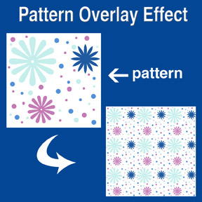 The picture at the left shows the initial pattern that was created in Photoshop with the brush and custom shape tools on a white background. Notice that none of the icons are cut off but are within the boundaries of the sides. This is to avoid imperfect repeating when the pattern is tiled. As was stated above, the background could have been transparent when the pattern was created so that it could have been placed on any color background. The repeated pattern in the example was created with the Pattern Overlay and was scaled down to about 20% while in the Pattern Overlay window.
Using the Pattern Stamp Tool
Using the Pattern Stamp tool (located on the tool bar behind the Clone Stamp tool) is an easy way to brush a partial pattern onto the layer. This adds interest to a background or motif. The tool has several options (located along the top of Photoshop's window) - brush selection, layer styles (mode), opacity, pattern selection. The only draw back to the Pattern Stamp tool is that the size of the pattern cannot be altered as it can in the Pattern Overlay. View the video "How to use pattern stamp tool in Photoshop (CS5 CS4 CS3, CS2 etc) tutorial" on how to use the Pattern Stamp tool. Note: The mouse has to be constantly held down while applying a pattern for it to be continuous. The tiling of the pattern is reset after the downward pressure of the mouse is released. Hint: Interesting textures to the pattern can be achieved by using textured brushes and even a variety of brushes on the same layer.
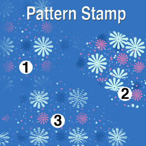 The patterns at the left were created with a transparent background pattern (same pattern as used in the Pattern Overlay example) and various brushes. The Star Burst brush was used for pattern number one (1), Flat Angle brush for number two (2), and Dune Grass brush for number three (3). The mouse was held down to get a continuous pattern for both number 1 and 3. On number 2, several iterations of pressing the mouse while applying the pattern and then releasing it created the collage look.
Creating Patterns with the Pattern Maker Filter
The Pattern Maker filter located in the pull down filter window is already loaded in Photoshop for version PS3 and below. However, for version PS4 and above it is an optional plug-in. It must be downloaded from Adobe's website. Pattern Maker slices an image and reassembles it randomly to create a tiled pattern. The image can be sampled and a pattern generated numerous times until you get a pattern that you like well enough to save as a pattern preset. Once saved as a pattern preset, it can then be used with the Pattern Stamp tool and Pattern Overlay effect. View "Photoshop Tutorial - Filters: Pattern Maker" and "Photoshop CS5: Tutorial Using the Pattern Maker Adobe Training Lesson 8.6" videos on how and when to use Pattern Maker.
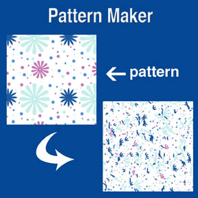 The picture at the left shows the initial pattern and the resulting scattered pattern that was generated in Pattern Maker. Using a pattern like this with Pattern Overlay or the Pattern Stamp tool makes an interesting background or border for your art collection.
Free Patterns
There are many websites that offer patterns (some free) for you to download. You can google the internet or start with "250 Free Design Patterns" and "900 Photoshop Patterns" found on artist Kate Harper's blog. Remember to get permission for commercial usage and check the copyrights before using any patterns found on the internet.
Related Articles
• "Creating Repeat Patterns with Photoshop, Illustrator and Artlandia Plug-in Software"
• "Photoshop Tip - Easy to Create Stripes and Plaids"
Comments are welcome. Post yours in the comment section (below).
Creating a Pattern and Using the Pattern Overlay Effect
A pattern is created as an image or a set of icons and is repeated (tiled). You can create your own custom pattern by using any motifs that are created in Photoshop or your own painted and scanned ones. You define the motifs as a pattern in Photoshop by selected the image with the marquee tool and select Edit / Define Pattern. You apply the created pattern to a layer by selecting the pattern overlay in the blending options effects (Layer /Layer Style / Pattern Overlay) or in the layers window click on the fx symbol at the bottom and select Pattern Overlay ... to open the Pattern Overlay window.
View "creating a Photoshop pattern" video to see a demonstration on how to create your own pattern and apply it to a layer by using the Pattern Overlay effect in Photoshop. The Pattern Overlay window allows you to adjust the scale of the patterns, the opacity, and use the Blend Mode effects. Note: As mentioned in the video, the layer cannot be blank but must have a color or image on it for the pattern to be visible. The color/image does not have to fill the entire layer. Hint: If you wish to have a transparent background for your pattern so that it can be used on any color or motif, make sure that the layer that the pattern was created on is transparent and none of the layers below it are visible including the background layer.
 The picture at the left shows the initial pattern that was created in Photoshop with the brush and custom shape tools on a white background. Notice that none of the icons are cut off but are within the boundaries of the sides. This is to avoid imperfect repeating when the pattern is tiled. As was stated above, the background could have been transparent when the pattern was created so that it could have been placed on any color background. The repeated pattern in the example was created with the Pattern Overlay and was scaled down to about 20% while in the Pattern Overlay window.
Using the Pattern Stamp Tool
Using the Pattern Stamp tool (located on the tool bar behind the Clone Stamp tool) is an easy way to brush a partial pattern onto the layer. This adds interest to a background or motif. The tool has several options (located along the top of Photoshop's window) - brush selection, layer styles (mode), opacity, pattern selection. The only draw back to the Pattern Stamp tool is that the size of the pattern cannot be altered as it can in the Pattern Overlay. View the video "How to use pattern stamp tool in Photoshop (CS5 CS4 CS3, CS2 etc) tutorial" on how to use the Pattern Stamp tool. Note: The mouse has to be constantly held down while applying a pattern for it to be continuous. The tiling of the pattern is reset after the downward pressure of the mouse is released. Hint: Interesting textures to the pattern can be achieved by using textured brushes and even a variety of brushes on the same layer.
 The patterns at the left were created with a transparent background pattern (same pattern as used in the Pattern Overlay example) and various brushes. The Star Burst brush was used for pattern number one (1), Flat Angle brush for number two (2), and Dune Grass brush for number three (3). The mouse was held down to get a continuous pattern for both number 1 and 3. On number 2, several iterations of pressing the mouse while applying the pattern and then releasing it created the collage look.
Creating Patterns with the Pattern Maker Filter
The Pattern Maker filter located in the pull down filter window is already loaded in Photoshop for version PS3 and below. However, for version PS4 and above it is an optional plug-in. It must be downloaded from Adobe's website. Pattern Maker slices an image and reassembles it randomly to create a tiled pattern. The image can be sampled and a pattern generated numerous times until you get a pattern that you like well enough to save as a pattern preset. Once saved as a pattern preset, it can then be used with the Pattern Stamp tool and Pattern Overlay effect. View "Photoshop Tutorial - Filters: Pattern Maker" and "Photoshop CS5: Tutorial Using the Pattern Maker Adobe Training Lesson 8.6" videos on how and when to use Pattern Maker.
 The picture at the left shows the initial pattern and the resulting scattered pattern that was generated in Pattern Maker. Using a pattern like this with Pattern Overlay or the Pattern Stamp tool makes an interesting background or border for your art collection.
Free Patterns
There are many websites that offer patterns (some free) for you to download. You can google the internet or start with "250 Free Design Patterns" and "900 Photoshop Patterns" found on artist Kate Harper's blog. Remember to get permission for commercial usage and check the copyrights before using any patterns found on the internet.
Related Articles
• "Creating Repeat Patterns with Photoshop, Illustrator and Artlandia Plug-in Software"
• "Photoshop Tip - Easy to Create Stripes and Plaids"
Comments are welcome. Post yours in the comment section (below).
Wednesday, December 7, 2011
Pantone Color Trends: 2012 Color of the Year
As I mentioned in my article "Art Licensing: 2011 Trends" Pantone is one of the major color trend setters for the fashion, home décor, and a variety of other industries. It influences many of the industries that license art. Using "on trend" colors in their art can help artists get deals. But not all manufacturers are influenced by trendy colors. For instance, home décor products and ceramic dinnerware are not frequently replaced by consumers. And those manufacturers tend to use art on their products that have tried and true color schemes. Of course there are exceptions and accent products for the home such as pillows may follow color trends. But over all, artists must be selective in using trendy colors, know the products that use or do not use them, and know what individual manufacturers want - trendy or traditional colors. In other words, do their homework!
Color of the Year
Pantone gets the most press when they announce their color of the year. And believe me, in recent years manufacturers and retailers are well aware what is the color for that year. Manufacturers are quick to showcase their products at trade shows that have at least a touch of that years color even if it is not the exact hue. Note: Because it usually takes at least a year for products to come to market, usage of the exact Pantone Color of the Year is delayed at least a year. In other words, the exact honeysuckle hue (2011 Pantone Color of the Year) will not be seen on products until 2012 or 2013 UNLESS artists were able to predict it a year ago and convince manufacturers that it will be a popular 2011 color.
Pantone poll designers in the fashion, home décor and other industries around the world to forecast the color each year. For information on how the 2011 color of the year was chosen, read "The New Hue for 2011 - How Honeysuckle Pink Was Chosen to Be Everywhere." Supposedly, honeysuckle was chosen because it is a stimulating color that lifts ones spirit due to the stress of the present economic times. Below is a list of colors Pantone selected for each year starting in 2000.
• 2011 - Pantone #18-2120 Honeysuckle (bright pink with a touch of orange)
• 2010 - #15-5519 Turquoise (deep greenish hue)
• 2009 - #14-0848 Mimosa (deep yellow)
• 2008 - #18-3943 Blue Iris (deep blue violet)
• 2007 - #19-1557 Chili Pepper (rust)
• 2006 - #13-1106 Sand Dollar (beige)
• 2005 - #15-5217 Blue Turquoise (medium blue hue)
• 2004 - #17-1456 Tigerlily (orange)
• 2003 - #14-4811 Aqua Sky (light blue turquoise)
• 2002 - #19-1664 True Red
• 2001 - #17-2031 Fuchsia Rose (bright rose)
• 2000 - #15-4020 Cerulean (medium violet blue)
And the Color of the Year for 2012 is . . .
Pantone #17-1463 Tangerine Tango
According to Pantone, Tangerine Tango as a spirited reddish orange will continue "to provide the energy boost we need to recharge and move forward." Read "2012 Pantone Color of the Year" for information about the new color and why it was chosen. Read "Tangerine Tango could shade the zeitgeist of 2012 as Pantone's color of the year" to find out what the press and retailers have to say about the new color.
And will manufacturers jump to showcase Tangerine Tango on their products at the January 2012 Atlanta Gift Show and other trade shows? You betcha they will IF they already have products with orange on them!
Comments are welcome. Post yours in the comment section (below).
Monday, December 5, 2011
New Art Licensing Seminar - January 28, 2012 Anaheim, CA
The Winter 2012 CHA (Craft and Hobby Association) Show (January 28 - February 1) is having seminars about the craft industry but unfortunately NONE about art licensing. However, those attending the show, live or are visiting the greater Los Angles area on January 28 can still attend an information packed art licensing seminar at Annabella Hotel (on the Anaheim Convention Center Campus). Successful licensed artists Karen Embrey, Phyllis Dobbs, and Brenda Pinnick will be presenting "The New Dynamics of Art Licensing." They will discuss the creation of licensable art, portfolios, and marketing materials, color and trends, approaching manufacturers, and MUCH MUCH more. The seminar will be from 6:30 to 8:30 PM followed by optional private consultations. The seminar does not conflict with any CHA activities because it is after the CHA Meet & Greet event. For information about the seminar, read "Exciting New Seminar!"
Subscribe to:
Posts (Atom)


