Joan Website | Joan Bio | Joan Licensing Info | Joan Contact Info | Blog Main Page

Art Licensing by artist Joan Beiriger: I'm happy to share art licensing info but please
give me credit and link to my blog when using it on your site. Thanks.

Tuesday, September 29, 2009

Are Style Guides Needed in Art Licensing?

Periodically artists ask if style guides are necessary, what do they look like, and how much do they cost. Read the following comments by art licensing coach Jeanette Smith of J'net Smith, Inc. about style guides that are paraphrased from her September "Ask J'net Free Friday - Q&A" teleseminar.

"When I worked on licensing Dilbert in the early 1990s, style guides cost from $20, 000 to $70, 000. Style Guides can be huge projects with big budget price tags for big properties. These large properties create style guides for those manufactuers that really want the property and expected the property creator to design the products. The style guides are created so that the style of the property is preserved.

Style guides provide all kinds of information and instructions to protect the integrity of the property. They usually include the fronts, backs, sides of characters, precise colors, size and proportion guidelines, type fonts, character descriptions, frequent sayings, and suggested layouts for products and retail displays, as well as suggesting patterns, icons and other elements for coordinating lines of products.

When artists are just starting out they probably won’t need a style guide. Usually a portfolio of art with mock-ups is all that is necessary. If the artist isn't well known then manufacturers won't expect a style guide. However, if you think that you do need a style guide, than I suggest that you figure out exactly why, what the purpose it is going to serve, and what needs to be in it. You may be able to get along with a small one that costs less or that you can create yourself. Most artists can go a long time without a style guide. They just need to keep building their portfolio and creating strong presentations for manufacturers."

For those artists that are further along on their path to building a brand and/or doing character licensing, consistent looks and colors from product to product is a must. In this case, style guides are important to make sure that they are preserved. Check out the following sites for more information and examples of what style guides look like.

1. See style guides for CD Comics. They show the poses of characters, the colors to be used, and the logo.
2. Artistic Solutions and Productions creates style guides for their clients. Their site has a description of what is in a style guide, their uses, and many examples.
3. Style guides are also used when many people are involved in large projects such as in video games. See an example of the elaborate style guide used for the video game Vega Strike.

Monday, September 28, 2009

Resource: Portals to Color Sites

The following two portals has links to many sites that show color pallets for art inspiration, examples of color mixing, let you generate color palettes from paintings, and much more.


2. Download a free color tool bar that you can use in conjunction with your internet browser. It was created by Cherish Flieder and links to over 30 color sites.

Saturday, September 26, 2009

What are Art Collections and Why Create Them?

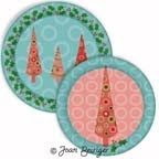
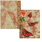
An art collection is a series of pattens, icons, and borders that are created to compliment a painting(s) so that it can be used in a variety of ways on numerous products. Artist / art director Joanne Fink of Lakeside Design may not be the first to create art collections but she sure has been the most vocal in embracing the concept. Joanne has given many talks at art licensing conferences spreading the word to artists about the advantages of creating collections around a painting (central image). Art collections can be created anyway you wish on any size paper. The example above shows a two page (8-1/2 by 11 inches each) spread of one of my own art collections. Read the following article for more information about art (themed) collections by Joanne Fink.

Themed Collections
by Joanne Fink of Lakeside Design

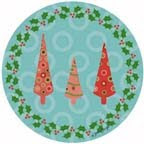
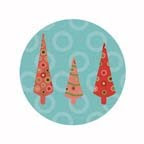
I think in terms of what I call ‘themed collections.' The purpose of a themed collection is to create a body of work that is formatted in enough different ways that manufacturers in different product categories will have all the parts and pieces they need to develop whatever shape and any type of product they want to make. By developing a themed collection in this manner, you can license the same collection to a tabletop manufacturer (who will need circular frames for plates), to a scrapbook manufacturer (who will be interested in backgrounds for scrapbooking papers and icons for stickers), and to a puzzle manufacturer (who will most likely only want a central image).

I define a collection as coordinated group of images containing most (if not all of the following):

1. Central image(s): 1 to 4
2. Frames: rectangular, circular, oval, square (preferably at least one of each; the rectangular and circular are the most important)
3. Borders: at least three (preferably in different widths – i.e. ½ inch, 1 inch, 2 inch)
4. Backgrounds: at least three (preferably created at 12 x 12 so they can be used as scrapbook papers).
5. Supplemental icons: at least 6 - more is always better. You can use the icons to build some of the backgrounds and borders.
6. Text: if appropriate

For detailed verbal information (sorry no visuals) on building themed collections listen to Joanne Fink's seminar that she gave at the 2006 CHA Winter Show. Session # 356 -D501: 2006 "Effective Marketing Strategies for the Art Licensing Business". The cost is $12.50.

To see pictures of themed collections created by Lakeside Design, go to their website. Note: Lakeside Design website was generated in flash so there is no direct link to the example pages. Use the following directions to locate the collection examples. After the website is open, click on services, then click on services for artists, then click on artwork development, and then click on see examples of themed collections click here.

Thursday, September 24, 2009

An Editorial on Color Trends

Google the words "color trends 2010" and over 3 millions links pop up. It seems that everyone and every industry has their own ideas on what the color trends for 2010 will be. So who's color tends should an artist follow? To tell you the truth I don't know but I can tell you what I do. I choose the top one or two sources in the industry that I am concentrating my design efforts. I check to see what colors are similar and use those for designing SOME new art. However, beware the colors predicted by the experts are not always accepted by manufacturers or consumers. For instance, several years ago bright red and chartreuse green were the "new" Christmas colors so artists rushed to use them. When licensees showed interest in the art, the artist was requested to alter the colors to the traditional darker red and green. Thus, I think it is better to design mostly in the color pallet that suits your art style and follow color trends sparingly.

But if you feel that using color trends is important in creating your art, read an interesting article on tracking your own trends titled Trend Spotting and Tracking - Chart Your Own by Jacqueline Gikow (Polymer Clay Polyzine, April 2002). And read articles by two top color trend forecasting organizations - Pantone Color Institute and Color Marketing Group.

Wednesday, September 23, 2009

Why Read Old Articles About Art Licensing

Even if art licensing articles were written years ago, you can still find valuable content in them. Art licensing truths stay the same and it is interesting to know what the industry was like before the most recent recession. The only thing you need to remember is that old articles contain old news when the articles mentions upcoming trends and what is selling at retail. Read three informative and interesting articles. Two were written in 2003 and one in 2007.

1. L!CENSING 2003 offers opportunities for artists (Art Business News, March 2003)


Tuesday, September 22, 2009

Creating Boards for Inspiration

Creating inspirational boards can be great fun to build as well as a wonderful tool for all kinds of inspiration. They can be for brainstorming new art ideas, staying on track in creating a unified look to art for branding purposes, or even for reminding yourself that you too can be successful in art licensing. The walls in my studio are covered with art and the shelves are lined with not only books but products showcasing other artists work. The example shown is a bulletin board with greeting cards and products that I have collected of different artists art. Each product tells a story of the artist that I've met or wish to meet and the journey she/he has taken along the path to licensing the art.

I didn't realize that other artists also use inspiration boards until a friend gave me the link to an article called Mood Board 101: Branding and Image Development. Read Talyab Raja article on how he uses boards for all kinds of design inspiration.

Monday, September 21, 2009

What Does it Take to Make it in Art Licensing?


Everyone has an opinion on what it takes to become successful in art licensing. What is deemed success to one artist is not necessarily considered success to another. Thus, it is important for you as an artist to read different opinions from art licensing experts so that you can make choices on what will work best for you. Read the following article by art agent John Haesler of MHS Licensing on what he feels an artist must do in order to achieve success in art licensing.

What Does it Take to Make it in Art Licensing?
by John Haesler of MHS Licensing

The following are five things that are imperative to enjoy success in art licensing:

1. Electronic Capabilities/computer Savvy:
It is a busy world and things move at the speed of the internet. Potential licensees expect to be able to view your work online and to receive it on disc. Eventually they will need to be able to give the art to their factories electronically for reproduction on product. If you don't know how to capture and manipulate images electronically, we strongly suggest you learn.

2. An Awareness of Trends in the Marketplace:
Manufacturers and potential licensees expect a lot more from artists than pretty pictures. They expect the artist to have an awareness of what is going on in the marketplace, the trends, the next "hot" thing. Read consumer magazines, shop various retailers from Wal-Mart to Neiman Marcus, and use the internet and sites such as dailycandy to find out what the "experts" are predicting. If cherries are coming on as a hot trend, you may seriously want to think about painting cherries!

3. Product Development Skills:
Manufacturers see a lot of art and have the luxury of having ideas spoon-fed to them. You can't just show them your image. You have to show them what your image will look like on their product. Come up with innovative new shapes or colors for the products. Express your creativity. They are looking for ideas and if you can provide them, you will have a much higher perceived value than the other artists they are considering. If you can't visualize your images on their products, they won't be able to either.

4. Thick Skin and a Day Job:
The number of artists that have entered the license marketplace has skyrocketed in the last few years. The competition is fierce. As wonderful as your work is, you are still going to be turned down often. It is hard to hear "no" about something you are passionate about. It takes a long time to get established in the business and to build a revenue stream. Licensing will not support you and your family on the first day or even the first year.

5. Hire an Agent:
There are many benefits to working with an agent; they have access and credibility with hundreds of potential licensees that will help jump start you into licensing. They can give you direction and encouragement, and they manage the business so you can do what you do best which is to create. Just like with lawyers and accountants, there are good agents, and less than good agents so do your homework before hiring one. However once you hire one, listen to the advice they give you. That is one reason you are paying them.

For another perspective on achieving art licensing success, read "Ten Secrets to Success in Art Licensing" by Lance Klass owner of Porterfield's Fine Art Licensing.

Saturday, September 19, 2009

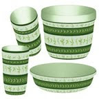
Adobe Illustrator - Creating 3D Product Mockups

Adobe Illustrator has some neat commands (different than in Photoshop) that also allows you to create product mock-ups. I still need to experiment more with them before I post a tutorial so this article is just a teaser to show you an amazing example of what can be done in Illustrator. Terrible aren't I?

To create a product mock-up, you first need to create a 3D shape and then map art onto the shape. What is absolutely great about creating 3D shapes is that they can be rotated any way you wish and the mapped art is automatically adjusted. See the two glasses in the example. Also once you create the basic shape, you can change the dimensions and thus have a whole family of shapes (glasses, vases, pots, bowls). All the shapes in the example are from one basic 3D shape. Learning how to use this method is more complicated than doing mock-ups in Photoshop but once a 3D shape is created it can be used over and over again with different art. Thus, future mock-ups for the same shape can be created faster and easier than in Photoshop. Stay tuned for tutorials on how to create product mock-ups in Adobe Illustrator.

copyright © 2009 Joan Beiriger

Friday, September 18, 2009

Licensed Art - Getting Paid Takes a Long Time

It can take 18 months or more before an artist gets any money after a deal is signed unless the artist is lucky to get an advance toward royalties. The reason is because of the many steps envolved during the entire process (contract negotiations, art revisions, manufacturing of product, placement on retail shelves) before receiving the first quarterly royalty check. How long it takes depends upon the industry but paper products made in the U.S. usually takes a shorter time than ones that need the creation of molds and are manufactured and shipped from China. Valerie Adams of Mosaic Art Licensing Agency has shared the following life cycle of licensed artwork when an artist has an agent. This is only an example and the time and number of steps can vary from contract to contract but it illustrates why it takes so long for an artist to get paid for the use of her/his art.

Life Cycle of Licensed Artwork . . .
by Valerie Adams, Mosaic Art Licensing Agency

2009
June: Artist sends artwork to agent.
July: Agent reviews artwork to determine if artwork is appropriate for market.
August: Agent submits artwork to company/manufacturer for consideration.
September: Agent negotiates and secures signed licensing agreement with company/manufacturer. Agent sends artwork to company/manufacturer.
October: Company/manufacturer contacts agent to request revisions to artwork. Agent communicates request changes to artist.
November: Artist returns completed revised artwork to agent. Agent sends artwork to the company/manufacturer so they can start their product design process.
December: Company/manufacturer internal product design review process starts. Product design approved and/or additional revisions to be made are identified.

2010
January: Company/manufacturer makes final revisions to their product design.
February: Final artwork/files sent to be manufactured.
March-May: Manufacturing of product(s).
June: Product ships from Asia.
July - August: Product ships to retailer.
September - December: Product on retailer shelves.

2011
April: First quarterly royalty check sent out.

Wednesday, September 16, 2009

Art Licensing Resource - Surtex Newsletter

The Surtex show's newsletter called On The Surface has really interesting articles on art licensing and allows artists/agents that are exhibiting to place editorials. The newsletter usually is published around January thru June each year but they surprised us this year and published a September issue. This issue has the usual good articles including one by Francesca Ash (editor of Total Art Licensing magazine) on "Industry's Future is Bright . . . If Artists Take the Right Steps." Click here for the link of the On the Surface September issue. To check out other On the Surface issues, click here for the link.

Tuesday, September 15, 2009

Photoshop Tip - Making Mockups Look Realistic

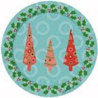
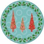
Go the extra step and create mock-ups look like realistic products by using the drop and inner shadow effects in Photoshop Layer Style command. The following tutorial gives depth and roundness to the rim of a plate. You can also use this technique to make other mock-up shapes look realistic. Warning: If mock-ups are too realistic looking, they may look like actual products and manufacturers may think that the art on them have already been licensed. To avoid confusion, I recommend that you use signage stating that the art is available for licensing.


1. In Photoshop, place art formated for a round plate in one layer. Duplicate that art layer in the layers window so that there are two duplicate layers.


2. Create a template that hides all the art except the border of the plate by doing the following steps. a. Create a new layer and use the round marquee tool located on the tools bar to make a round shape. Hold down the shift key as you move the mouse to the right so that the shape is perfectly round. The size doesn't matter because you will later change it. b. Fill the shape with color by using the paint bucket tool. Any color can be used but in this example I used white. c. Use the free transform command (Mac = command + T; Windows = cntl + T) to resize the template to the desired size so that only a border around the plate will show. d. Center the template and art by selecting the template layer and the art layers. Use the align vertical center and align horizontal commands that is located on the option bar ( Mac = across the top of the window) to align the layers.

3. Select the template layer and use the magic wand tool located on the tools bar and click outside the template.

4. Select the top art layer and press the delete key. The art outside the template of the top art layer has now been deleted as shown in the example at the left.


5. The template layer is no longer needed so it can be deleted or made invisible. In the example at the left, both art layers are visible. Select the top art layer and use the drop shadow effect in the Layer Style command. Do this by selecting the "fx" button at the bottom of the Layers palette and choose the drop shadow effect from the pull down menu. I used the following settings but you can adjust them to get the effect you want. Blend mode = multiply; color is a darker shade of background color; opacity = 75; angle = -40; distance = 23; spread = 0; distance = 250; quality was left as the default.

6. Select the bottom art layer and use the inner shadow effect in the Layer Style command. Do this by selecting the "fx" button at the bottom of the Layers palette and choose the inner shadow effect from the pull down menu. I used the following settings for the example at the left. Structure: blend=multiply; opacity = 76; angle -40: distance 5; choke = 0; size = 65. You now have a plate mock-up that is realistic looking.


Copyright © 2009 Joan Beiriger

Sunday, September 13, 2009

What are Retailers Looking for in a Licensed Property/Brand?

Understanding retailers and what they are looking for can help artists get their art onto products and into stores. The major need that retailers are searching for is product differentiation to drive consumers to their stores. The following article by John Haesler of MHS Licensing describes differentiation and other retailer needs. John is an expert in this area because he spent 12 years as a buyer and Licensing Director at Target before joining MHS Licensing agency in 2001. MHS Licensing agency represents 33 artists and brands including the Hautman Brothers. In 2008, the Hautman Brothers art on products grossed $60 million at retail.

What are Retailers Looking for in a Licensed Property/Brand?
by John Haesler, MHS Licensing

First you need to understand the channels of retail: Retailers are segmented into several different distribution channels. The traditional channels are Gift (Mom and Pop, independent stores), Department Stores (Federated - Macy's, Bloomingdale's), Mid-tier (Sears, Penney's, Kohl's), and Mass (Wal-Mar, K-Mart). The evolution of retailing and the desperate attempt to create a unique niche for themselves has enabled some retailers to create their own channels: mass with class (Target), Discounters (TJ Max, Ross Stores), Down and Dirty (Dollar General, Dollar Stores).

While each of these retailers are slightly different, they are each looking for the same things from a licensing property/brand . . .
• help differentiate them from their competition
• add some perceived value to their assortments
• bring some kind of built in equity which the retailer can benefit from quickly
• either match their current demographics or help them acquire a demographic they are seeking
• offer some kind of promotional opportunities

Differentiation: Retailer X does not want to have to carry the exact same product as Retailer Y because then they have to engage in price wars. Thus, if they can have something different, they don't have to compete. Consider offering an exclusive to a particular retailer or at the very least offer a different version/design.

Perceived value: The retailers know they are paying a premium (due to royalties) for licensed product and will have to probably price it higher than generic. Your property must offer a perceived value to justify that higher price. Insist that your licensees build in some value added features to your licensed product to make the consumer feel good about spending the extra money. (i.e. a tie in such as environmentalism/education).

Equity: The retailer does not want to spend its advertising dollars building your brand. You MUST have already done that. They are however, happy to spend their advertising dollars bragging that they have your property, IF, your property is recognized by their customers. Leverage media exposure, get on Oprah, make the cover of Time magazine but somehow build awareness.

Demographics: Pick a demographic and stick with it. The world is too specialized. You can't be all things to all people. If you are a kid's property, embrace that and be the best kid's property you can be. Don't try to be an adult property. The retailers see right through that. The only way to be all things to all people is to spend a lot of money to change the public's perception, or to have a lot of equity built in already. Find a retailer who is trying to appeal to your demographic and go after them.

Promotional Opportunities: Retailers are looking for new marketing handles and campaigns. Be creative and think beyond coupons and contests. How can the retailer leverage your property or its attributes to drive more traffic to their store? Spoon feed them ideas and they will eat them up.

Thursday, September 10, 2009

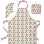
Photoshop Tip - Creating Kitchen Textile Mockups


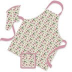
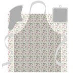
Creating kitchen textile or any flat product mock-up is easy to do because it only involves placing art on top of the template and deleting everything outside it. In this tutorial, I'll show how I create an apron, oven mitt and potholder mock-up by using templates and a pattern from one of my art collections.

1. Create three templates - apron, mitt and potholder shapes. Templates can be created by tracing a picture of a generic shaped apron, mitt and potholder or drawing your own shapes in Photoshop. In this example, I created a basic apron shape on one layer and the apron ties on another layer. I did the same for the oven mitt and potholder. The basic shape of the mitt, potholder and the trims for each are on separate layers. Therefore, there are six layers for these three templates.

2. Place a pattern of art in a separate layer. Make another copy of the pattern by holding down the option button (Windows = Cntl) and drag the pattern to the right. Do this again so that you will have the same pattern on three layers for use on the three templates.

3. In the layers window, make one of the pattern layers 50% opacity. Move the pattern on top of the apron template and resize it by using the free transform command (Mac = command + T; Windows = cntl + T).

4. Go to the basic apron template layer and use the magic wand tool to select everything outside the template. Go to the pattern layer and push the delete key. You should now see the pattern in an apron shape.

5. Go to the apron tie template layer and use magic wand tool to select the inside of the ties. Press the delete key to remove the color and then use the paint bucket tool to fill the ties with your color choice.

6. Repeat steps 3 through 5 for the oven mitt and also for the potholder. You now have a kitchen textile mock-up.

Hint: Arrange the mock-ups attractively on a page as shown at the beginning of this tutorial. Also merge the layers of each mock-up and use the Layer Style command / drop shadow effect. Select the "fx" button at the bottom of the Layers palette and choose the drop shadow effect from the pull down menu. By adding the drop shadow, you make the mock-up "pop."

Copyright © 2009 Joan Beiriger

Wednesday, September 9, 2009

Protecting Art in the POD Industry

For those of you who use POD (Print On Demand) websites to sell products with your art on them, you know how difficult it is to protect your art. You do all the right things (copyright notices, small images, low resolution images, etc.) but people still steal your art. Read the following article on being proactive in this industry written by JGoode. Her tips are helpful to not only POD artists but to all artists that license their art.

How do we protect our art?
by JGoode

Yet another story goes out about someone using someone else’s art without permission. It’s a hard place to sit with this topic because no matter the answer or the plan of action, it’s just a frustrating, nerve wracking and often down right depressing situation to find one’s work used without the artist giving the thumbs up to do so.

I think the question isn’t just how do we protect our work – it’s also how do we manage and react when it’s used without our permission?

Read the rest of the article by clicking here.

Tuesday, September 8, 2009

Art Licensing Resource - ebooks on Art Licensing by Tara Reed

I have found that many of the published books about art licensing while having their uses don't always go into enough detail. Tara Reed's e-books (electronic books in pdf file formats) have lots of detail and the information in them are not just theoretical but learned from being in the art licensing trenches. They are well written and illustrated, has great how-to lists, and pertinent and thought provoking interviews and tips from other artists. I've read the following three e-books and they are just what I needed. An added plus is that you don't have to wait for the books to be shipped but you get your pdf file right away so that you can start reading immediately. Click on each title to read more.


Sunday, September 6, 2009

Book Review: Pattern Factory edited by Ayako Terashima

This book looks really interesting. It will be released on September 22 and can be ordered from amazon.com for $19.79. The following review is by Adam Bryce.

Definitely one of the most exciting books we have heard of this year. Releasing 22nd September ‘Pattern Factory’ focuses on unconventional contemporary patterns created by cutting edge illustrators and graphic designers, showing how these unique patterns are created, applied to products, and presented in stores. With full-color illustrations throughout, it showcases more than 100 images by artists and designers created for such high proļ¬le clients as Nike, Medicom Toy, Bernard Willhelm, PAM, Eley Kishimoto, Sk8tething, Fergadelic and Silas, with a foreword written by Will Sweeny.

With an exclusive CD of brand-new design elements that readers can use to make their own patterns, Pattern Factory is a remarkable resource for artists, illustrators, fashion designers/enthusiasts, and graphic designers. Click here to see page examples in the book including product mock-ups.

Saturday, September 5, 2009

Licensing Art to Discounters is BIG Business

Whether or not you want to see your art on products in discount stores, licensing art for products (mostly gift bags) in these stores is (or was) a huge business. I couldn't believe how big until I found out how many stores these chains own and thus the potential in making a lot of money even when an item costs only $1 or less a pop. Dollar General has over 8,300 stores in 35 states; Big Lots over 1000 stores, Dollar Tree over 3500 stores in 48 states, Family Dollar over 6500 stores in 44 states, and 99 Cents stores over 300. That is a whopping nearly 20,000 stores that sell licensed products! No wonder artists are licensing art for use in discount stores.

However, these lucrative licensing opportunities for artists may be coming to an end. For years I've been following this industry and I've looked at the bottoms of thousands of bags in order to see whose art are on the bags and if they are copyrighted. Three years ago licensed art on gift bags from individual artists and art agencies were the only art seen. Now more and more art is purchased outright or the bags sold in discount stores are from manufacturer overstock. Even the licensed art seem to be more from design studios than from individual artists.

Copyright@2009 Joan Beiriger

Friday, September 4, 2009

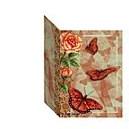
Photoshop Tip - Creating Gift Bag Mockups

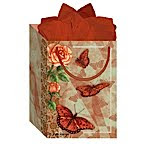
Gift bag mock-ups are a little more complicated to do than the mock-ups I showed in my Photoshop Tip - Using the Transform Command for Product Mock-ups tutorial. In this tutorial, I use a bunch of Photoshop commands and tools to create realistic gift bags. Look up the tool or command names in Photoshop help menu if you aren't familiar with them or don't know where they are located.


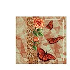
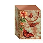
1. In the first layer, place a vertical art image (art example are butterflies and roses art) to the right of the window that will be used as the front panel of the bag.

2. In a second layer below the front panel layer, place vertical art to be used for the bag side panel (art example is a mottled pattern). I show a full size panel in the example but it only needs to be half that width.


3. Use the marquee tool (located on the tool bar) and delete approximately half the side panel art or only create a narrow panel in the first place. Move the side panel art next to front panel and select both layers (front and side panels) in the Layers window. Use the align vertical center command that is located on the option bar ( Mac = across the top of the window) to align both layers.


4. Use the free transform tool on the panel layer (Mac = command + T; Windows - Cntl + T) , hold down the command key (Windows = Cntl key) and move the center left handle on the bounding box up and to the right to shear the panel. Use the hue/saturation command (Mac = command + U; Windows= Ctrl +U) and move the Lightness slider bar to the left (approximately to a minus 25) to darken the side panel and give the bag more dimension.


5. Open a new layer and use the polygonal lasso tool (located in the tool bar) to create the inside of the bag. By using this tool you are essentially creating a skewed box. Select the colors you wish in the foreground and background color window on the tool bar. Then use the gradient tool to fill the skewed box with a gradation of color.

6. In a separate layer, draw a handle for the bag with the brush tool. If you wish, you can make the handle look more rounded by using the Layer Style command / Inner Glow effect. Select the "fx" button at the bottom of the Layers palette and choose the inner glow effect from the pull down menu. In my example, I used the following settings to make the handle look rounded. Structure: blend=screen; opacity = 55; noise = 0; color = cream. Elements: Technique = softer; source = center; choke = 0; size = 43. Quality was left with the default settings.

7. For a little bit of pizazz to the mock-up you can add tissue paper to the bag. I created the tissue paper by taking a picture of a gift bag with tissue paper in it. In Photoshop, I then deleted everything in the picture except the tissue paper and place the tissue paper layer between the front panel layer and the inside bag layer. Note: It doesn't matter what colored tissue paper you take a picture of because the color can be easily altered in Photoshop.

Copyright © 2009 Joan Beiriger

Wednesday, September 2, 2009

You are not Alone - The Trials and Tribulations of Other Artists

What better way not to feel alone and to inspire you is by reading about how other artists got started in licensing, their trials, their tribulations and eventually their success. Artist Kate Harper has posted several artist's stories on her blog. These stories might make you sad, or laugh, or make you say to yourself that I've been there but they show that you aren't the only one struggling to license your art. You too can have success!


Marketing your Art with Tearsheets


Creating tearsheets (also called promo sheets or storyboards) is an excellent way to market your art to potential licensees. There is no right or wrong way to create tearsheets and any art can be placed on them. Some artists put four to six different central images (paintings, llustrations, or images) on a sheet. Others place art and product mockups of one collection on a sheet. Personally I think tearsheets with one collection containing one or more central images and mock-ups makes a statement and showcases the art. A single 8-1/2 by 11 inch sheet is often used but any size is okay. Contact information on each sheet is a must and it also helps if you add a number and name of the collection. When talking to a manufacturer, it is easier to refer to the collection with a name and/or number than to call it that yellow daffodil and violet flower art.

I format my tearsheets in several different ways depending on what manufacturer(s) I'm targeting. If I am doing a mass mailing (either by email or "snail mail") to different industries, I put a central image(s) and numerous mock-ups of products for different industries on the sheet. Illustrated above is my BOU001 collection tearsheet with a central image and mock-ups for tabletop, bedding, and decorative flags. Note: The reason why I usually put central images on tearsheets is because the art in mock-ups may be too small or not clear enough because of the shape of the mock-ups. Better yet, I find it really effective to create tearsheets customized to individual industries. I usually send three to six tearsheets from different collections at a time.


My TEA001 collection tearsheet was created for fabric manufacturers. Notice that I show only swatches of patterns because the swatches are clear enough and the manufacturer doesn't need to see the central image. And before you sharp-eyed artists contact me, I know a couple of patterns on the tearsheet do not repeat. I goofed and they need to be corrected.


My BOU001 collection tearsheet was created for tabletop manufacturers. If I was sending them to party manufacturers, I could replace the cup with a paper cup shaped mock-up. Notice the border across the top of the tearsheet. Some artists like to put a border of art across the top to differentiate art collections on tearsheets. It makes it easier for art directors to find art when they have a slew of printed tearsheets on their desk and need to flip through them.

Copyright@2009 Joan Beiriger

This article was written in 2009.  For more information and an update on what is now more commonly referred to as sell sheets instead of tear sheets, read artist Natalie Timmons "How to Create a Killer Sell Sheet for Artists" and download a pdf file showing more examples of sell sheets.