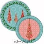
 Go the extra step and create mock-ups look like realistic products by using the drop and inner shadow effects in Photoshop Layer Style command. The following tutorial gives depth and roundness to the rim of a plate. You can also use this technique to make other mock-up shapes look realistic. Warning: If mock-ups are too realistic looking, they may look like actual products and manufacturers may think that the art on them have already been licensed. To avoid confusion, I recommend that you use signage stating that the art is available for licensing.
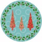
1. In Photoshop, place art formated for a round plate in one layer. Duplicate that art layer in the layers window so that there are two duplicate layers.
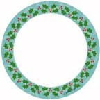
2. Create a template that hides all the art except the border of the plate by doing the following steps. a. Create a new layer and use the round marquee tool located on the tools bar to make a round shape. Hold down the shift key as you move the mouse to the right so that the shape is perfectly round. The size doesn't matter because you will later change it. b. Fill the shape with color by using the paint bucket tool. Any color can be used but in this example I used white. c. Use the free transform command (Mac = command + T; Windows = cntl + T) to resize the template to the desired size so that only a border around the plate will show. d. Center the template and art by selecting the template layer and the art layers. Use the align vertical center and align horizontal commands that is located on the option bar ( Mac = across the top of the window) to align the layers.
3. Select the template layer and use the magic wand tool located on the tools bar and click outside the template.
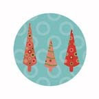
4. Select the top art layer and press the delete key. The art outside the template of the top art layer has now been deleted as shown in the example at the left.
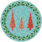
5. The template layer is no longer needed so it can be deleted or made invisible. In the example at the left, both art layers are visible. Select the top art layer and use the drop shadow effect in the Layer Style command. Do this by selecting the "fx" button at the bottom of the Layers palette and choose the drop shadow effect from the pull down menu. I used the following settings but you can adjust them to get the effect you want. Blend mode = multiply; color is a darker shade of background color; opacity = 75; angle = -40; distance = 23; spread = 0; distance = 250; quality was left as the default.
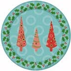
6. Select the bottom art layer and use the inner shadow effect in the Layer Style command. Do this by selecting the "fx" button at the bottom of the Layers palette and choose the inner shadow effect from the pull down menu. I used the following settings for the example at the left. Structure: blend=multiply; opacity = 76; angle -40: distance 5; choke = 0; size = 65. You now have a plate mock-up that is realistic looking.
Copyright © 2009 Joan Beiriger


I noticed that the pictures of the plate mock-ups are too small to actually show the shadowing and roundness of the rim. Trust me, these mock-ups look realistic when they are larger and at a higher resolution.
ReplyDeleteGreat lesson! You should teach a class!!!!!
ReplyDelete