You may be aware of the difference between RGB and CMYK color modes (also known as spaces) and when to use each one but if you do not know the difference read "Photoshop Tip: When to Use RGB and CMYK Color Gamut." Photoshop also contains six more modes (Bitmap,Grayscale, Duotone, Indexed Color, Lab Color, Multichannel) that determine how color and images are displayed on the monitor and printed. I found that Bitmap, Grayscale, Duotone, to be occasionally useful in altering art for interesting and different looking images and Lab Color to be very useful in adjusting the color intensity of images.
The different color modes in Photoshop is found in Images / Mode. Notice that some of the modes are not accessible while the image is in RGB (default mode) and CMYK. First select Grayscale mode to access those modes. Below is a description and comments on using Grayscale, Bitmap, Duotone and Lab Color modes.
Note: Indexed Color is useful for Web graphics because the file size is small. However, it has a very small color range of only 256 colors and thus limits the color in art. Multichannel is a flexible way of manipulating colors and take much experimenting. I do not find either of these modes helpful in tweaking or creating art used for licensing. But if you do find them useful, I welcome comments on how you use them.
 Grayscale Mode
The Grayscale mode can use up to 256 different shades of gray in a raster image. The brightness values range from 0 (black) to 255 (white) per pixel (single point).
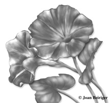
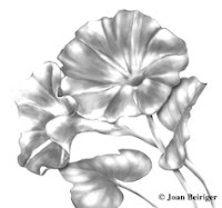
The first image at the left shows the Grayscale image after it was converted from RGB (shown at the top of this article). The contrast is poor. Notice the improvement in contrast in the second image when the Curves adjustment command (command + U keystrokes) was used to correct it. To find out how to use the Curves command click on the links to the videos listed in "Photoshop Tip: Correcting Art with Levels & Curves Adjusting Commands."
Possible uses:
1. Even though a colored image looks fine, the contrast may be poor as shown by the examples. But it is hard to determine in a colored image and easier when the image is converted to grayscale. Hint: Convert your art from ordinary to extraordinary by temporarily converting the color image to grayscale to see if the contrast needs adjusting. Then undo the grayscale command and use the Curves command to tweak the contrast on the colored file.
2. Sometimes it is easier to change colors of an image if the color is first removed by using the Grayscale mode. Then in the RGB, CMYK, or Lab mode, colors can be added with the Levels or Curves commands. This is especially helpful for monotone images for backgrounds or patterns in art collections.
3. Even though black and white art is not always desirable for products, sometimes a black and white motif in combination with colored motifs are effective. Use the Grayscale mode to convert the colored image to black and white. Note: Grayscale gives a truer black than does RGB and CMYK.
 Bitmap Mode
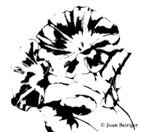
The Bitmap mode uses one of two color values (black or white) to represent the pixels in an image. The image at the left was first converted to Grayscale and then to Bitmap. Note: To make a more distinguished and clearer image, I should have adjusted it with Curves while it was in Grayscale before converting to Bitmap.
Possible use:
Bitmap images can be used in patterns and backgrounds or even as spot images in a design. Convert the image to a color mode and apply color for a monotone look. About 2005 many of the vintage tweal designs that were popular for fabrics were bitmap images.
In Photoshop, duotone refers to grayscale images with an increased tonal range of tinted grays. One color (monotone), two colors (duotone), three colors (trione) and four colors (quadtone) can be used together to produce interesting color looks. The example shown is from a Grayscale image colorized with a blend of black plus Pantone 1365U (light orange) to produce a peudo sepia tone look.The different color modes in Photoshop is found in Images / Mode. Notice that some of the modes are not accessible while the image is in RGB (default mode) and CMYK. First select Grayscale mode to access those modes. Below is a description and comments on using Grayscale, Bitmap, Duotone and Lab Color modes.
Note: Indexed Color is useful for Web graphics because the file size is small. However, it has a very small color range of only 256 colors and thus limits the color in art. Multichannel is a flexible way of manipulating colors and take much experimenting. I do not find either of these modes helpful in tweaking or creating art used for licensing. But if you do find them useful, I welcome comments on how you use them.

 Grayscale Mode
The Grayscale mode can use up to 256 different shades of gray in a raster image. The brightness values range from 0 (black) to 255 (white) per pixel (single point).
The first image at the left shows the Grayscale image after it was converted from RGB (shown at the top of this article). The contrast is poor. Notice the improvement in contrast in the second image when the Curves adjustment command (command + U keystrokes) was used to correct it. To find out how to use the Curves command click on the links to the videos listed in "Photoshop Tip: Correcting Art with Levels & Curves Adjusting Commands."
Possible uses:
1. Even though a colored image looks fine, the contrast may be poor as shown by the examples. But it is hard to determine in a colored image and easier when the image is converted to grayscale. Hint: Convert your art from ordinary to extraordinary by temporarily converting the color image to grayscale to see if the contrast needs adjusting. Then undo the grayscale command and use the Curves command to tweak the contrast on the colored file.
2. Sometimes it is easier to change colors of an image if the color is first removed by using the Grayscale mode. Then in the RGB, CMYK, or Lab mode, colors can be added with the Levels or Curves commands. This is especially helpful for monotone images for backgrounds or patterns in art collections.
3. Even though black and white art is not always desirable for products, sometimes a black and white motif in combination with colored motifs are effective. Use the Grayscale mode to convert the colored image to black and white. Note: Grayscale gives a truer black than does RGB and CMYK.
 Bitmap Mode
The Bitmap mode uses one of two color values (black or white) to represent the pixels in an image. The image at the left was first converted to Grayscale and then to Bitmap. Note: To make a more distinguished and clearer image, I should have adjusted it with Curves while it was in Grayscale before converting to Bitmap.
Possible use:
Bitmap images can be used in patterns and backgrounds or even as spot images in a design. Convert the image to a color mode and apply color for a monotone look. About 2005 many of the vintage tweal designs that were popular for fabrics were bitmap images.
Possible use:
Duotone images are easily created and are ideal for colorizing Grayscale and Bitmap images for backgrounds, textures and patterns.
It is also an easy way to create sepia tone vintage looks.
Duotone images are easily created and are ideal for colorizing Grayscale and Bitmap images for backgrounds, textures and patterns.
It is also an easy way to create sepia tone vintage looks.
 Lab Color Mode
Lab Color mode has a huge color range. It describes how color looks based on the human perception of color. Adjusting colors with Lab is less intuitive than RGB or CMYK. The L (lightness) channel is used to adjust color intensity. The "a" channel represents how red or green a color is. The negative values represent green and the positive ones red. The "b" channel represents how blue or yellow a color is. The negative values represent blue and the positive ones yellow.
The first example show the results of an image when the "a" channel in Lab mode is used to adjust color toward the red hue with the Curve command.
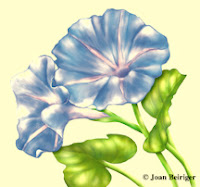 The second image at the left show the results when the "b" channel in Lab is used to adjust color toward the yellow hue. Both of those examples were flattened layer images so the colors were applied to the entire image. Ideally color changes would be made to separate layers with individual images.
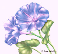
 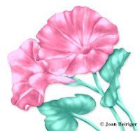 Example three at the left show color changes to a three layer file with the Lab mode - white background, flower blossoms, and leaves / stems. Note: Just because the colors are brilliant does not mean that they will appear that way when printed. Always convert the image to the CMYK mode for more accurate colors. This example has not yet been converted to CMYK.
Possible Uses:
1. Using the lightness channel in Lab with the Curves command is a far superior way to sharpen images than in RGB or CMYK. It produces a sharpened and more balanced effect without degrading the image.
2. I find Lab an easy way to tweak images that need just a bit more brilliant color. I find it easier to get the look I want in Lab than in RGB or CMYK.
I welcome any comments. Please write them in the comment section below.


No comments:
Post a Comment