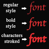
You can do all of the above by using the Character panel (choose Window / Character) and create all sorts of interesting effects. In the Character panel you can adjust the text for color, bold, italic, all caps, subscript, subscript and underline. You can also select any font, font size, kerning (adding or subtracting space between two characters), vertical / horizontal scale, set baseline shift (moving the characters up or down relative to the baseline), set leading (space between lines of type), and set tracking (loosening or tightening the space between characters). Hint: If you want to make the text bolder than you can achieve with the bold command, you can apply a stroke (part of the blending option) to make it as bold as you wish.
By the way, Photoshop fonts are created as vector images. That means text will stay sharp no matter what size it is enlarged as long as it is not rasterized. For more information on vector and rasterize images read "What is the Difference between Photoshop and Illustrator?"
Below are several examples of the effects you can achieve by editing text in the character panel and making characters bolder by using the stroke style. The Apple Chancery font is used in all the examples.
 Making Text Bold
The Apple Chancery font has only one style but by selecting the text and opening the Character panel (choose Window / Character) you can select the bold symbol (T) to make the text bold (line two in the example at the left).
You can also stroke the text to make it as bold as you wish (line three in example at the left). To do this 1. Select the text layer in the Layer window. 2. Open Blending Option by clicking on the fx symbol at the bottom of the layers pallet and select Stroke. The Layer Style window will open with the Stroke style checked. 3. Increase the size of the stroke by moving the size slider to the right. Select the color of the stroke as the same color of the text. Press OK when finished. The stroke in the example at the left is 8px. Note: If you later decide to change the color of the text, you will also need to change the Stroke color to match.
Changing the Space Between Characters
The space between characters in the text (kerning) can be increased or decreased in the Character panel (choose Window / Character) by putting the cursor between two character and increasing or decreasing the kerning values in the av symbol box (kerning). The kerning was increased to 200 between each character (one at a time) in the example at the left.
Changing the Space Between Text Lines
The spacing between lines of text (leading) can be increased or decreased in the Character panel (choose Window / Character) by selecting all the text and increasing or decreasing the leading values in the A/A symbol box (leading). The leading was increased 72 pt in the example at the left.
Shifting the baseline of Text
Characters can be moved up or down in relationship to the baseline in the Character panel (choose Window / Character) by selecting the text and increasing or decreasing the baseline values in the Aa symbol box (baseline shift). The effect in the example at the left was achieved by typing the character A at 72 pt and the characters pple at 36pt. The character A was left at 0 pt baseline. The characters pple were selected and the baseline increased to 30 pt.
I welcome any comments or information you would like to share.


Hi, I enjoyed your post, I work in photoshop everyday, but always need a refresher on fonts, so thanks! I just started following your blog, I am new to art licensing and I have found your blog to be very informational.
ReplyDeleteThis is really a good stuff!!!!
ReplyDeleteKeep blogging and thank you so much for sharing......
Hmm it will help me in my work! thanks a lot!
ReplyDelete