Joan Website | Joan Bio | Joan Licensing Info | Joan Contact Info | Blog Main Page

Art Licensing by artist Joan Beiriger: I'm happy to share art licensing info but please
give me credit and link to my blog when using it on your site. Thanks.

Wednesday, February 24, 2010

What is the Difference between Photoshop and Illustrator?

Knowing the difference between Adobe Photoshop and Adobe Illustrator can help you choose which software to use when creating and enhancing your art. Photoshop generates raster (bitmap) images while Illustrator generates vector images. Note: Scanned art is converted to raster images.


Raster Images
Raster Images are composed of square dots called pixels. The more dots per inch (dpi) in an image the better the detail (resolution). If an image is scanned or created at a low resolution and later increased, the image tends to become blurry. Photoshop tries to fill in the missing pixels when the resolution is increased but it is not always successful. That is why it is recommended that you create and scan art at 300 dpi (preferred resolution for most manufacturers) or even greater.

The example at the left shows the blurry (jaggy) edges of a shape that was originally saved at 72 dpi and then enlarged to 300 dpi. The same thing happens when a small painting is enlarge too much in Photoshop. Enlarging the design increases the size of the pixels creating jaggy edges. Thus, you should not create or scan small paintings or any painting at low resolution because when increased too much the design will become blurry. Note: All of my art is created at 300 dpi with the smallest side of the design no smaller than 12 inches.

Vector Images
Vector images (objects) are made up of points that are connected (paths) by lines and curves. Because the object and placement on the page is described mathematically, the resolution is not degraded when the object is enlarged. Note: Vector file sizes tend to be smaller and print faster than raster files.

Comparison of Photoshop and Illustrator
The main tool in Photoshop (brush) is more intuitive to use than Illustrator's main tool (pen). The brush and pencil tools in Photoshop works similarly to actually painting with brushes and drawing with pencils but the pen tool in Illustrator uses a different technique that requires the user to click and drag the mouse to make objects. There is a definite learning curve in producing complex shapes in Illustrator. But once you master the pen tool you can make some fantastic free-form curves (called Bezier curves) that are absolutely smooth which would be difficult if not impossible to do with the brush tool in Photoshop.

Photoshop does have some vector tools such as the text, shape, and pen tools. Because those tools are vectors, the resolution is not degraded when the objects are enlarged.

The look and the shading of images in Illustrator is also different than in Photoshop. Illustrator uses gradients of color to shade an object so art created in it looks more illustrative. Photoshop shading is pixel by pixel so art generally looks more painterly.

Hint: I have found that using the pen tool in Photoshop is more difficult than Illustrator's pen tool. So I normally use the pen or brush tool in Illustrator when I want to make smooth-edged complex-shapes such as ribbons (shown in the example at the left). By working back-and-forth between Photoshop and Illustrator, you can create some interesting and beautiful art.


When Should You Use Photoshop and Illustrator?
If you want to create 3D product mock-ups for your art, you need to use Illustrator. If your art style is painterly or you scan your art, you need to use Photoshop. If your art style is more contemporary or illustrative looking with crisp edges you may want to use Illustrator. Many artists that design patterns for the fabric industry find Illustrator better to use than Photoshop. Editing colors of objects for different colorways is easier to do in Illustrator than in Photoshop. And, if you want smooth and crisp outlines of motifs for the rubber stamp industry, templates for product development/design, etc. you will want to use Adobe Illustrator.

Check out artist Kathy Weller's blog article "Vector vs. Raster art (for children's edu illustrators or anyone who wants a good black line)" on why she uses raster applications (in her case Adobe Flash) for some of her art.

I welcome any comments or suggestions. Please write them in the comment section below. 

Monday, February 15, 2010

Art Licensing Tip: Turning Rejection into Success


A MUST read is Kate Harper's five part article "Dealing With Rejection: Tips for Card Designers" that uses examples for card designers but is directly applicable to the entire art licensing industry. Below are my comments on some of the tips Kate mentions in the articles. These apply to the entire art licensing industry.

1. Approach the right Manufacturer. It is usually a waste of time to submit designs to manufacturers that do not use your type of art style and/or images. Of course, there are always exceptions and manufacturers may decide to branch out.

2. Get feedback when rejected. This is very important so that you learn what type of art and images that the manufacturer wants. Knowing this information is HUGE because you can use it to create art that they DO want.

Get feedback from more than one manufacturer in the same industry. Just because one manufacturer is not interested in your work does not mean that another won't be. But if you get rejected by several, it is time to either adjust your art or move on to submitting your art to another industry.

3. Be willing to change your art. Licensing is a business. If you are unwilling to alter your art to manufacturers specifications than licensing may not be the right business for you. Manufacturers know their customers and what sells. Be prepared to change a color, crop or add to the design, and remove or add a motif.

If you have any comments about this article, please voice them in the below comment section.

Wednesday, February 10, 2010

Licensing Art to the Flag Industry


There are many companies that manufacturer flags but most of them are for niche markets such as flags for individual US states, landmarks, national and state parks, museums, sports, and colleges. I have found only a few manufacturers that license art and those are for the decorative and garden flag industry. A decorative flag is usually large (28 by 40 inches) and hangs from a pole that is attached to a building. A garden flag is ususally small (12 by 18 inches or smaller) that hangs from a metal stand that is inserted into the ground.

Manufacturers license various art styles from traditional to illustrative. Art themes are for everyday such as garden, floral, animal, and inspirational or for specific holidays. Some of the manufacturers also license basic motif/icon art for their applique stitched flags. Just with every industry, decorative and garden flag manufacturers are looking for certain things in art.

Flag manufacturers normally want art that is:
1. unique,
2. that "pops,"*
3. has saturated colors, and
4. is in a vertical format.**

* For flags, image(s) must be easily discernible five or more feet away. That means that the background cannot be so busy that the main/central image blends into it.

** The design ratio for flags is normally 7/10. That ratio is approximately the same ratio of the standard size of greeting cards (5 by 7 inch). As a result, greeting card art needs only to be slightly adjusted to fit decorative and garden flags. Caution: If your original art is only 5 by 7 inches, that art enlarged to fit a 28 by 40 inch flag would have VERY poor resolution. Thus, it is better to create larger designs if you plan to license them to flag manufacturers.

Hint: Keep in mind that you should create other formats for your art besides vertical. Some flag manufacturers also produce additional products such as floor mats and mailbox covers so you could potentially license the same art for other products if you also format your art horizontally.

It is a good idea to see what kind of art on flags is selling at retail before approaching a manufacturer. Check out Garden House Flags (internet store) to see decorative flags from various manufacturers. Then look up the websites of following manufacturers and call them for their art submission guidelines if they are not listed.

Carson Home Décor


Note: There are more manufacturers that license art for flags than the ones listed above. If you are willing to share that information, please email me the information at joan@joanbeiriger.com and I will add that information to the above list.

If you have any comments about this article, please voice them in the below comment section.

Friday, February 5, 2010

Photoshop Tip: Quick Method to Color Correct Scanned Art and Photographs

Often photos and scanned art needs the color corrected in Photoshop because the lighting conditions for the photos or the setup parameters in the scanner software is not quite right. Correcting the colors can be time consuming and frustrating when adjusting the colors with Photoshop's curve, level, or hue/saturation options. Digital photographer expert, Eddie Tapp, shows in his article "90% Method of color correction basics" how to correct colors simply, fast, and almost full proof by using the info palette and eyedropper tool in Photoshop. I'm not going to repeat the simple steps that Eddie Tapp shows in his pdf article because he does an excellent job. However, I do have a few comments.

1. This method depends on having white and black in the image so if it does not you will need to use another method to correct colors. Hint: If the art you want to scan does not have black and white in it, you can add a black and white swatch to the border or adjacent to the image before you scan it. You can use them to correct the colors and later removed them while in Photoshop.

2. To open the Info window mentioned in the article, go to the Photoshop Windowpulldown menu and select Info or press F8 if the F keys are active on your keyboard.

3. You need to hold down the shift key (at least in the Photoshop CS3 version) when you use the eyedropper to lock in the color information in the Info window.

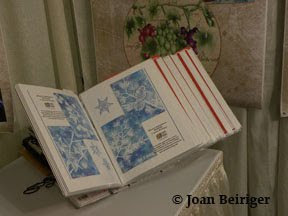
This is a photo that I took of my portfolio under poor lighting conditions while exhibiting at the January 2010 Licensing and Design section Atlanta Gift Show.


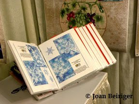
This shows the photo after I made the color correction using Eddie Tapp's "90% Method." It literally took less than one minute to do.


If you have any suggestions or thoughts about this article, please voice them in the below comment section.