Walking and exhibiting at the Surtex show is an amazing experience. Exhibitors have the opportunity to showcase their newest creations and meet with manufactures. The artists walking the show had a chance to see what is needed to exhibit at a future show and have more time than the exhibitors to find inspiration by walking the three shows running concurrently (Surtex, NSS, ICFF), attend conferences, and network. Read about inspiration found at the three shows in "Surtex 2011 plus NSS & ICFF shows: Inspiration !"
Seminars
This year Surtex offered a whopping ten seminars lasting 1-1/2 hours each. The seminars were arranged in three Core Basics Licensing (practicality, creativity, marketing & presentation), three Business Practices (licensing agreements, protecting art, structures, staffing and more), three Trends (art, retail, digital), and Manufacturer and ArtistWorking Together session. Panelists were experts in licensing, manufacturing, retail, publishers, and the digital industries. They gave indispensable information about art licensing and related subjects.
I've been studying the art licensing industry for over ten years and my mind was spinning with the amount of information that was shared during the sessions. I learned a lot that was new to me. And the subjects not new to me were slanted from a different viewpoint which taught me even more information. The cost of the seminars were well worth the investment in learning about trends, how to license, the best business practices, and how to market art. Kudos goes to Jeff Grinspan (art & licensing consultant at artmoid.com) for organizing the seminars, persuading industry experts to give the presentations, and moderating most of the sessions. Also kudos to the panelists for sharing their knowledge, disrupting their schedules, taking time away from their booths and all without receiving a fee. Their generosity is greatly appreciated by everyone!
Networking
Licensing art is all about building relationships and what better way to build a relationship with manufacturers than by exhibiting at Surtex. Networking with manufacturers and potential licensees are also important in finding out what art style and themes "work" and what does "not work" for their companies. Networking with fellow artists and licensing experts is also beneficial in an art licensing career to learn how the industry works and provide support when needed. By attending Surtex, many artists new to licensing and also not so new had the opportunity to network with the exhibitors, persons attending the 25th Surtex Anniversary party, persons attending the conferences and with the panelists after the seminars. Read agent Maria Brophy's viewpoint on the importance of networking at "Three Reasons to Exhibit at a trade show." Even though Maria did not exhibit Drew Brophy's art at Surtex, her article illustrates the importance of networking.
Attendee and Exhibitor Surtex Experiences
Read the following blog articles by some of the attendees and exhibitors on their Surtex experience. Exhibitor articles include photos of their booths.
Attendees
Alex Colombo
Debbi Ridpath Ohi
Kate Pitner
Marilyn MacGregor
Nicole Tamarin
Phyllis Dobbs
Exhibitors
Beverly Dyer
Carol Van Zandt
Cindy Ann Ganaden (part 1) & (part 2)
Dena Fishbein (Dena Designs)
Genevieve Gail Swinford
Jane Shasky
Jessica Swift
Jim Marcotte ( agent for Two Town Studios)
Kate Spain
Kathy Weller
Laurie Wisbrun
Leah Duncan
Lilla Rogers Studio (agency)
Lily Ashbury
Linda Warner Constantino (artist for linadona botanica)
Sharyn Sowell
Learning about art licensing can be done without attending Surtex or other trade shows. But by not attending or exhibiting at them, an artist / agent misses the one-to-one contacts with clients and others in the industry. It is important to make those contacts because licensing art is all about building relationships. Surtex is the largest trade show in the U.S. that showcases art for licensing. It is a great way to meet people that are passionate about art licensing, learn about the latest trends, and share experiences by networking with artists, agents and manufacturers.
Comments are welcomed. Please click on comments and write them in the comment window at the bottom.
Monday, May 30, 2011
Monday, May 23, 2011
2010 Top 125 Global Licensors
Advanstar Communications just released their digital April 2011 edition of License! Global magazine. The annual Top 125 Global Licensors are listed in it - insert pages T1 to T30 (after page 42). I found it very disappointing that only a couple of art brands were listed. Artist Jim Shore sold $176 million art on product at retail, Suzy Zoo $150 M at retail and Thomas Kinkaid once again listed at $400M. I find it hard to believe that art revenue of other artists and art agencies dropped so much that they did not make the top 125 especially since the last one on the list is US Army at $30M. Although, last year the revenue for art licensors definitely dropped. Jim Shore dropped from $205M in 2009 to $176M in 2010 and Suzy Zoo from $235M in 2003* to $150M in 2010.
Note: The $400M at retail listed for Thomas Kinkaid may not be accurate because his manufacturing operation that reproduces his art filed for Chapter 11 bankruptcy protection in June 2010. See Business and Criticism of business practices on Thomas Kinkade's page in Wikipedia.
* Suzy Zoo has not been listed on the top licensors list since 2003.
For previous years information on top art licensors, read "Tracking the Success of Top Art Licensors," and "2009 Top Art Licensors."
Comments are welcomed. Please click on comments and write them in the comment window at the bottom.
Note: The $400M at retail listed for Thomas Kinkaid may not be accurate because his manufacturing operation that reproduces his art filed for Chapter 11 bankruptcy protection in June 2010. See Business and Criticism of business practices on Thomas Kinkade's page in Wikipedia.
* Suzy Zoo has not been listed on the top licensors list since 2003.
For previous years information on top art licensors, read "Tracking the Success of Top Art Licensors," and "2009 Top Art Licensors."
Comments are welcomed. Please click on comments and write them in the comment window at the bottom.
Saturday, May 21, 2011
Surtex 2011 plus NSS & ICFF shows: Inspirational !
Walking trade shows are a wonderful source of inspiration for creating art. And the eye-candy seen at the Surtex show, The National Stationery Show (NSS)*, and the International Contemporary Furniture Fair (ICFF) at the Jacob K. Javits Convention Center in New York this week surely was stocked full of inspiration. In fact, there was so much that I often had to take a break because it was SO overwhelming. Note: A badge from the Surtex show gained admittance to all three shows that were running concurrently.
*The name of the Stationery show gives the impression that only greeting card companies exhibit at it. Not true! All kinds of companies exhibited that are associate with the stationery industry (pens & pencils, ribbons, wrapping paper, gift bags, party ware, etc. etc. etc.) or made with paper. In fact, the 2011 show directory has the words PAPER POWER on the cover.
When walking the shows, artists get inspiration not only from other artists work but colors or lack of, accessories or lack of, and layouts used in the booths at all the shows.
NSS
At the NSS show the type of products, colors, ways products were displayed and the booths accessorized were amazing. Truly eye-candy galore. The designs ranged from none to just a hint of geometric motifs to whimsical, to fine art and everything in between. Products were accessorized with jewels, glitter and metallics. They were made of paper, all kinds of plastic, leather, wood and stone. An exhibit called The Paper Runway stole the NSS show at least as far as I was concerned. It was comprised of about 20 mannequins wearing unique dress styles and created all with paper. It was an amazing sight that stopped attendees in their tracks. See a few of them in the picture at the top of this article. The exhibit was a contest among cutting-edge fashion designers, design students from New York City LIM College, and the design studio of DCWV. It was sponsored by Kate's Paperie.
Inspiration comes from everywhere and attending trade shows are my favorite ways to find it. Now I have to assimilate what I saw at the shows and start to apply it to my art. And, that will not be an easy task because I saw SO much.
Joan
I welcome any suggestions and comments. Please write them in the comment section below.
*The name of the Stationery show gives the impression that only greeting card companies exhibit at it. Not true! All kinds of companies exhibited that are associate with the stationery industry (pens & pencils, ribbons, wrapping paper, gift bags, party ware, etc. etc. etc.) or made with paper. In fact, the 2011 show directory has the words PAPER POWER on the cover.
When walking the shows, artists get inspiration not only from other artists work but colors or lack of, accessories or lack of, and layouts used in the booths at all the shows.
ICFF
For instance, many of walls in the ICFF booths were white and were blank. And the only color in the booth was on the contemporary designed furniture. The white walls may have been effective in showcasing the contemporary furniture but they really did not give me any inspiration to create art OR did they? Yes they did! But in a completely unexpected way. After walking down row after row of booths, I kept visualizing the blank walls filled with art that complemented the colors and the simple lines of the furniture. And I also imagined products with and without art that accessorized the room containing the furniture. Even though there was no eye-candy per se, the displays created inspiration at the most basic level!NSS
At the NSS show the type of products, colors, ways products were displayed and the booths accessorized were amazing. Truly eye-candy galore. The designs ranged from none to just a hint of geometric motifs to whimsical, to fine art and everything in between. Products were accessorized with jewels, glitter and metallics. They were made of paper, all kinds of plastic, leather, wood and stone. An exhibit called The Paper Runway stole the NSS show at least as far as I was concerned. It was comprised of about 20 mannequins wearing unique dress styles and created all with paper. It was an amazing sight that stopped attendees in their tracks. See a few of them in the picture at the top of this article. The exhibit was a contest among cutting-edge fashion designers, design students from New York City LIM College, and the design studio of DCWV. It was sponsored by Kate's Paperie.
Surtex Show
What a thrill to see hundreds of booth displaying all styles and themes of art at Surtex. I did not take any pictures of booths because it is not allowed unless you get permission from the exhibitors and I did not have the time. I plan to post a future article that has links to blogs written by Surtex exhibitors and attendees so you should see some booths. Meantime, view "Surtex '11 Days Away" that Surtex posted on youtube.com previous to the show. It is mostly about the surface designers attending the show and was probably filmed in 2010 but still a good source of inspiration. Also checkout the one minute videos that some exhibitors submitted to Surtex. They were playing on monitors in the Surtex Resource Center. To see them, open youtube.com and search for "Surtex 2011" to get a listing of the videos.Inspiration comes from everywhere and attending trade shows are my favorite ways to find it. Now I have to assimilate what I saw at the shows and start to apply it to my art. And, that will not be an easy task because I saw SO much.
Joan
I welcome any suggestions and comments. Please write them in the comment section below.
Labels:
Licensing Inspiration,
Show/Licensing,
Show/Trade
Friday, May 13, 2011
Photoshop Tips: Using Color Modes to Alter Art
You may be aware of the difference between RGB and CMYK color modes (also known as spaces) and when to use each one but if you do not know the difference read "Photoshop Tip: When to Use RGB and CMYK Color Gamut." Photoshop also contains six more modes (Bitmap,Grayscale, Duotone, Indexed Color, Lab Color, Multichannel) that determine how color and images are displayed on the monitor and printed. I found that Bitmap, Grayscale, Duotone, to be occasionally useful in altering art for interesting and different looking images and Lab Color to be very useful in adjusting the color intensity of images.
The different color modes in Photoshop is found in Images / Mode. Notice that some of the modes are not accessible while the image is in RGB (default mode) and CMYK. First select Grayscale mode to access those modes. Below is a description and comments on using Grayscale, Bitmap, Duotone and Lab Color modes.
Note: Indexed Color is useful for Web graphics because the file size is small. However, it has a very small color range of only 256 colors and thus limits the color in art. Multichannel is a flexible way of manipulating colors and take much experimenting. I do not find either of these modes helpful in tweaking or creating art used for licensing. But if you do find them useful, I welcome comments on how you use them.

Grayscale Mode
The Grayscale mode can use up to 256 different shades of gray in a raster image. The brightness values range from 0 (black) to 255 (white) per pixel (single point).
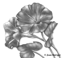
The first image at the left shows the Grayscale image after it was converted from RGB (shown at the top of this article). The contrast is poor. Notice the improvement in contrast in the second image when the Curves adjustment command (command + U keystrokes) was used to correct it. To find out how to use the Curves command click on the links to the videos listed in "Photoshop Tip: Correcting Art with Levels & Curves Adjusting Commands."
Possible uses:
1. Even though a colored image looks fine, the contrast may be poor as shown by the examples. But it is hard to determine in a colored image and easier when the image is converted to grayscale. Hint: Convert your art from ordinary to extraordinary by temporarily converting the color image to grayscale to see if the contrast needs adjusting. Then undo the grayscale command and use the Curves command to tweak the contrast on the colored file.
2. Sometimes it is easier to change colors of an image if the color is first removed by using the Grayscale mode. Then in the RGB, CMYK, or Lab mode, colors can be added with the Levels or Curves commands. This is especially helpful for monotone images for backgrounds or patterns in art collections.
3. Even though black and white art is not always desirable for products, sometimes a black and white motif in combination with colored motifs are effective. Use the Grayscale mode to convert the colored image to black and white. Note: Grayscale gives a truer black than does RGB and CMYK.
Bitmap Mode
The Bitmap mode uses one of two color values (black or white) to represent the pixels in an image. The image at the left was first converted to Grayscale and then to Bitmap. Note: To make a more distinguished and clearer image, I should have adjusted it with Curves while it was in Grayscale before converting to Bitmap.
Possible use:
Bitmap images can be used in patterns and backgrounds or even as spot images in a design. Convert the image to a color mode and apply color for a monotone look. About 2005 many of the vintage tweal designs that were popular for fabrics were bitmap images.
In Photoshop, duotone refers to grayscale images with an increased tonal range of tinted grays. One color (monotone), two colors (duotone), three colors (trione) and four colors (quadtone) can be used together to produce interesting color looks. The example shown is from a Grayscale image colorized with a blend of black plus Pantone 1365U (light orange) to produce a peudo sepia tone look.The different color modes in Photoshop is found in Images / Mode. Notice that some of the modes are not accessible while the image is in RGB (default mode) and CMYK. First select Grayscale mode to access those modes. Below is a description and comments on using Grayscale, Bitmap, Duotone and Lab Color modes.
Note: Indexed Color is useful for Web graphics because the file size is small. However, it has a very small color range of only 256 colors and thus limits the color in art. Multichannel is a flexible way of manipulating colors and take much experimenting. I do not find either of these modes helpful in tweaking or creating art used for licensing. But if you do find them useful, I welcome comments on how you use them.

Grayscale ModeThe Grayscale mode can use up to 256 different shades of gray in a raster image. The brightness values range from 0 (black) to 255 (white) per pixel (single point).
The first image at the left shows the Grayscale image after it was converted from RGB (shown at the top of this article). The contrast is poor. Notice the improvement in contrast in the second image when the Curves adjustment command (command + U keystrokes) was used to correct it. To find out how to use the Curves command click on the links to the videos listed in "Photoshop Tip: Correcting Art with Levels & Curves Adjusting Commands."
Possible uses:
1. Even though a colored image looks fine, the contrast may be poor as shown by the examples. But it is hard to determine in a colored image and easier when the image is converted to grayscale. Hint: Convert your art from ordinary to extraordinary by temporarily converting the color image to grayscale to see if the contrast needs adjusting. Then undo the grayscale command and use the Curves command to tweak the contrast on the colored file.
2. Sometimes it is easier to change colors of an image if the color is first removed by using the Grayscale mode. Then in the RGB, CMYK, or Lab mode, colors can be added with the Levels or Curves commands. This is especially helpful for monotone images for backgrounds or patterns in art collections.
3. Even though black and white art is not always desirable for products, sometimes a black and white motif in combination with colored motifs are effective. Use the Grayscale mode to convert the colored image to black and white. Note: Grayscale gives a truer black than does RGB and CMYK.
Bitmap ModeThe Bitmap mode uses one of two color values (black or white) to represent the pixels in an image. The image at the left was first converted to Grayscale and then to Bitmap. Note: To make a more distinguished and clearer image, I should have adjusted it with Curves while it was in Grayscale before converting to Bitmap.
Possible use:
Bitmap images can be used in patterns and backgrounds or even as spot images in a design. Convert the image to a color mode and apply color for a monotone look. About 2005 many of the vintage tweal designs that were popular for fabrics were bitmap images.
Possible use:
Duotone images are easily created and are ideal for colorizing Grayscale and Bitmap images for backgrounds, textures and patterns.
It is also an easy way to create sepia tone vintage looks.
Duotone images are easily created and are ideal for colorizing Grayscale and Bitmap images for backgrounds, textures and patterns.
It is also an easy way to create sepia tone vintage looks.
Lab Color ModeLab Color mode has a huge color range. It describes how color looks based on the human perception of color. Adjusting colors with Lab is less intuitive than RGB or CMYK. The L (lightness) channel is used to adjust color intensity. The "a" channel represents how red or green a color is. The negative values represent green and the positive ones red. The "b" channel represents how blue or yellow a color is. The negative values represent blue and the positive ones yellow.
The first example show the results of an image when the "a" channel in Lab mode is used to adjust color toward the red hue with the Curve command.
The second image at the left show the results when the "b" channel in Lab is used to adjust color toward the yellow hue. Both of those examples were flattened layer images so the colors were applied to the entire image. Ideally color changes would be made to separate layers with individual images.
Example three at the left show color changes to a three layer file with the Lab mode - white background, flower blossoms, and leaves / stems. Note: Just because the colors are brilliant does not mean that they will appear that way when printed. Always convert the image to the CMYK mode for more accurate colors. This example has not yet been converted to CMYK.Possible Uses:
1. Using the lightness channel in Lab with the Curves command is a far superior way to sharpen images than in RGB or CMYK. It produces a sharpened and more balanced effect without degrading the image.
2. I find Lab an easy way to tweak images that need just a bit more brilliant color. I find it easier to get the look I want in Lab than in RGB or CMYK.
I welcome any comments. Please write them in the comment section below.
Subscribe to:
Posts (Atom)