Joan Website | Joan Bio | Joan Licensing Info | Joan Contact Info | Blog Main Page

Art Licensing by artist Joan Beiriger: I'm happy to share art licensing info but please
give me credit and link to my blog when using it on your site. Thanks.

Monday, June 28, 2010

Photoshop Tip: Color Correcting Art with Levels & Curves Adjusting Commands

Often when art is scanned and imported into Photoshop, the colors need to be corrected with either the Levels or Curves adjusting commands. It is tempting to use the Levels to correct colors because it is easy to use and the Curves command is not as intuitive. In fact Curves can be down right confusing and difficult to use until you understand how. However, Curves is really a better choice to correct colors because it allows you to adjust 14 different tonal points while Levels only allows you to adjust 3 (white point, black point, gamma). Also Curves allows you to make precise adjustments to individual color channels. For those reasons, I think it is worthwhile learning how to use Curves to color correct art.

I found that the best method to learn how to use Curves is to watch Photoshop tutorials. I recommend watching "Photoshop - Curves vs Levels" to see the amazing improvement of contrast and colors in a photograph when using Curves instead of Levels. And once you know what you are doing, Curves is just as easy to use as Levels. By watching the following short videos, you will get a more in depth knowledge about Curves. Note: Some of steps and techniques in each of the videos are the same but I still found them all useful because each offers different explanations and viewpoints.

1. "Photoshop Curves Tutorial - Part 1"
2. "Photoshop Curves Tutorial - Part 2"
3. "Photoshop CS4 - Color Curves" (also shows how to use Curves in CS3)

Most likely using the techniques shown in the above videos will color correct your art well enough. However, if it does not or you want even more in depth information on how to use an advanced color correcting method in Curves with the info pallet, watch the 26 minute video "Color Correcting Photos: photoshop CS3!"

If you would like to share information or comments about this article please click on the below comment button.

Monday, June 21, 2010

Photoshop Tip: Editing Font Characteristics

In Photoshop you can easily adjust the font size, orientation, sharpness, alignment, color, and numerous warps by selecting the text and using the controls in the text options bar (under the menu bar at the top of the window). But the characteristics of a font (spacing between characters, spacing between lines of text, etc.) are dependent on how the font was created. Also some fonts are created with only one style while others may have several such as italic, and bold. For instance, the font Apple Chancery has only one style while the font Times includes regular, italic, bold, and bold italic styles. But what do you do when you really like a particular font and it does not have the bold or italic style that you need? Or what do you do if you would like to change some of the characteristics of the font such as the spacing between characters?

You can do all of the above by using the Character panel (choose Window / Character) and create all sorts of interesting effects. In the Character panel you can adjust the text for color, bold, italic, all caps, subscript, subscript and underline. You can also select any font, font size, kerning (adding or subtracting space between two characters), vertical / horizontal scale, set baseline shift (moving the characters up or down relative to the baseline), set leading (space between lines of type), and set tracking (loosening or tightening the space between characters). Hint: If you want to make the text bolder than you can achieve with the bold command, you can apply a stroke (part of the blending option) to make it as bold as you wish.

By the way, Photoshop fonts are created as vector images. That means text will stay sharp no matter what size it is enlarged as long as it is not rasterized. For more information on vector and rasterize images read "What is the Difference between Photoshop and Illustrator?"

Below are several examples of the effects you can achieve by editing text in the character panel and making characters bolder by using the stroke style. The Apple Chancery font is used in all the examples.
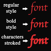
Making Text Bold
The Apple Chancery font has only one style but by selecting the text and opening the Character panel (choose Window / Character) you can select the bold symbol (T) to make the text bold (line two in the example at the left).

You can also stroke the text to make it as bold as you wish (line three in example at the left). To do this 1. Select the text layer in the Layer window. 2. Open Blending Option by clicking on the fx symbol at the bottom of the layers pallet and select Stroke. The Layer Style window will open with the Stroke style checked. 3. Increase the size of the stroke by moving the size slider to the right. Select the color of the stroke as the same color of the text. Press OK when finished. The stroke in the example at the left is 8px. Note: If you later decide to change the color of the text, you will also need to change the Stroke color to match.

Changing the Space Between Characters
The space between characters in the text (kerning) can be increased or decreased in the Character panel (choose Window / Character) by putting the cursor between two character and increasing or decreasing the kerning values in the av symbol box (kerning). The kerning was increased to 200 between each character (one at a time) in the example at the left.

Changing the Space Between Text Lines
The spacing between lines of text (leading) can be increased or decreased in the Character panel (choose Window / Character) by selecting all the text and increasing or decreasing the leading values in the A/A symbol box (leading). The leading was increased 72 pt in the example at the left.

Shifting the baseline of Text
Characters can be moved up or down in relationship to the baseline in the Character panel (choose Window / Character) by selecting the text and increasing or decreasing the baseline values in the Aa symbol box (baseline shift). The effect in the example at the left was achieved by typing the character A at 72 pt and the characters pple at 36pt. The character A was left at 0 pt baseline. The characters pple were selected and the baseline increased to 30 pt.

I welcome any comments or information you would like to share.

Tuesday, June 15, 2010

Art Licensing Tip: Increase Art Size and Still Have Good Resolution

The article "Art Licensing Tip: Creating the Correct Art Size" discusses the loss of resolution if a painting is enlarged too much and recommends creating larger art. But what was not discussed is what can an artist do if she/he has already created small paintings and needs to extensively enlarge them. Is it still possible to have good resolution? Also not discussed was WHY a painting that was enlarged 2-1/3 times in Adobe Photoshop had good resolution. If it was enlarged in other pixel based software it probably would look jaggy. Does Photoshop do something magical?

Yep, Photoshop automatically uses a method called Bicubic Smoother when images are enlarged. By using an interpolation method, it resamples, adds pixels, and assigns color values to the new pixels based on the existing pixels color values in the image. Bicubic Smoother is the default method in replicating pixels but other methods can be selected which MAY give better results depending upon the image. These methods are called Nearest Neighbor, Bilinear, Bicubic, Bicubic Sharper. They can be selected in the pull down at the bottom of the Image / Image Size window in Photoshop. Find out more about these methods in the Photoshop Help menu.

So can small paintings that are enlarged still have good enough resolution to be used on products? Well Photoshops Bicubic Smoother method does a pretty good job up to a point but most likely not good enough if the paintings are extremely enlarged. For instance, if images where created for the standard greeting card 5 by 7 inch size and enlarged in Photoshop to the standard flag size of 28 by 40 inch (5-2/3 times) the edges of the art elements/icons in the image would most likely have a blurry halo. However, there is a software Plugin that can be used with Photoshop called Genuine Fractals 6 (recommended by artist Andy Mathis) by onOne Software that does a better job at replacing pixels than Photoshop's Bicubic Smoother. Genuine Fractals 6 Plugin claims that it can enlarge a picture 1000 percent without the loss of sharpness, detail, and without edge halos. It considers itself the industry standard for image resizing and according to reviews in computer magazines it is correct. When checking out comparison examples between Photoshop and Genuine Fractals 6 on One Software website, I was suitably impressed with the results by using it. The software costs $159.95 but it is well worth the price if you need to enlarge images beyond the capability of what Photoshop alone can produce. By the way, Genuine Fractals 6 has other useful features such as Gallery Wrap (professional version), Tiling, batch processing, etc.

Hmm, that brings up a question. If Genuine Fractuals 6 Plugin can enlarge small images and still have good resolution (assuming that the images were originally high resolution), can this software do a good job on enlarging low resolution images and also increase the resolution? If it can, then low resolution images on the internet are REALLY at risk on being illegally lifted and used for products and stock art. I do not yet own Genuine Fractual so that I could test it but it is worrisome.

I welcome any comments. Please click on "comments" in order to write your comment.

Licensing Art to Manufacturers

Read my article "How to License Art to Manufacturers" posted on Artsy Shark - A Site for Emerging Artists.

It discusses creating the right art, planning strategically, finding manufacturers that license art, contacting manufacturers and includes lots of links to art licensing resources and articles written by licensing experts.