Joan Website | Joan Bio | Joan Licensing Info | Joan Contact Info | Blog Main Page

Art Licensing by artist Joan Beiriger: I'm happy to share art licensing info but please
give me credit and link to my blog when using it on your site. Thanks.

Monday, November 30, 2009

Photoshop Tip - Using Color Dodge and Color Burn Mode to Touchup Art

There are times that art needs some shading to give it dimension and make it "pop." Rather than use the paintbrush tool to apply color to lighten and darken areas in the art that you need to manually blend in with the other colors you can use Photoshop's dodge and burn tools that automatically blends the colors for you. The dodge tool uses white to lighten colors and the burn tool uses black to darken colors. However, I do not think the blending of the colors look very natural by using white and black (especially on dark colors) so instead I often use other Photoshop methods. Read "Photoshop Tip - Using Photoshop to Shade Art and Mockups" for various shading methods.

I recently discovered (thanks to an internet tutorial) that Photoshop also allows you to automatically shade art with any color of your choice by using the color dodge and color burn mode. Notice that I used the word mode in referring to color dodge and color burn. They are not considered tools or located in Photoshop's tool menu.

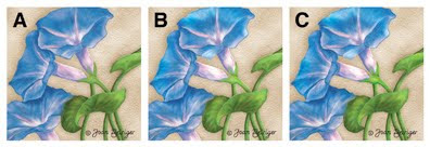
To clarify the above discussion, Photoshop has TWO dodge and burn methods of shading artwork. The one method that many artists know about is the dodge and burn tools located on the tool bar and the other one that artists may not know about is the color dodge and color burn mode located on the brush option bar. This tutorial illustrates how I used the color dodge and color burn MODE to make my morning glory art "pop."
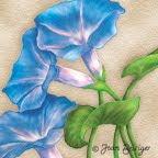


Original Art
The original art shown in picture A is okay but it obviously is lacking depth. Highlighting areas on the flowers and leaves will give it the much needed dimension to make the art "pop."

Using the Color Dodge Mode to Lighten Art
Picture B shows areas on the petals and leaves highlighted. I used the color dodge mode in Photoshop to lighten areas in the art and what an improvement it made in comparison to the original art shown in picture A. The color dodge mode is located in the options bar when the brush tool is selected. The options bar is at the top of the screen under the menu bar. The following steps show how to use it to lighten art.
1. Select the brush tool (Mac & Windows = B).
2. Go to the Mode pull down menu in the options bar and select Color Dodge located in the middle of the menu.
3. Duplicate the art layer (pull down menu in the layers window - at the top). You will want to be able to switch back and forth between the edited version of your art and original art. Also it is easy to over do the shading and you will want to make sure that you can start over again if needed.
4. Lock the layer at the top of the layer menu so that you will not paint outside the edges of the art. Of course, if the entire layer is filled with art you do not need to do this. Note: When using the "dodge tool," the tool does not allow you to paint outside the art so you do not need to lock the layer.
5. Select a brush tip from the brushes menu. I used a spray brush tip to highlight the morning glory art but any brush will work.
6. Reduce the opacity to 10 percent or less.
7. Select a color lighter than the art you wish to highlight. It is located in the color window (foreground) at the bottom of the tool bar.
8. Start highlighting your art while adjusting the size of the brush (increase size = ] key; decrease size = [ key), opacity, and switch to different brush colors as you highlight different colors until you get the desired look. Periodically switch back and forth between your original art layer and your edited art layer to make sure that you have not highlighted the art too much and washed out the colors.

Using the Color Burn Mode to Darken Art
Picture C shows the edited art after the color dodge and color burn mode was applied to selected areas. It does not look much different than picture B because I did not have to darken many areas in this painting. They were already dark enough.

Essentially follow the steps outlined for the color dodge mode (steps 1 through 8) to edit your art but select the color burn mode instead of the color dodge mode. The color for the brush needs to be darker than the art instead of lighter and most likely you will need to use a very low opacity (5 percent or less) when using the color burn mode.

Note: Make sure that you switch the mode back to the normal mode after you use the color dodge and color burn modes. Otherwise, the brush tool will not work properly the next time you use it for painting.

Friday, November 27, 2009

List of Non U.S. Art Licensing Agencies


The article "List of Over 50 U.S. Art Licensing Agencies" would not be complete unless I also do an article on non U.S. art licensing agencies. I could not find near as many agencies outside of the U.S. but below are the ones that I could find. If you know of others, please drop me a note at joan@joanbeiriger.com with the name and web address. Thanks.

United Kingdom
MGL

Germany

Netherlands

Tuesday, November 24, 2009

Photoshop Tip: How to Place Art Around a Circle

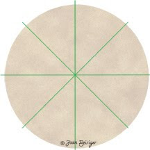
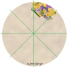
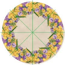
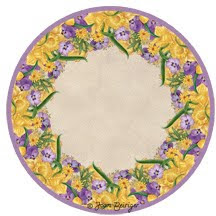
Unfortunately, in Photoshop you cannot automatically place a border of art around the outer edge of a circle. This tutorial demonstrates a method that takes a little work but is still fairly simple to do once you know how.


Creating a Circle
1. Create a new layer in the layers pallet (F7) by selecting the make new layer icon at the bottom of the layers window.
2. Create a circle by using the elliptical marquee tool on the tool bar (Apple and Windows = M). Hold down the shift key while you drag the tool to make it completely circular.
3. Fill the circle with a color by using the bucket tool (Apple & Windows = G) or place a background pattern on the circle and delete the excess as I did in this example.

Creating Template Lines as Guides for the Placement of Art. In this example, I used four lines to divide the circle into eight spaces.
4. Create a new layer.
5. Select a foreground color on the tools pallet that is different than the circle color.
6. Select a brush (Mac & Windows = B) with a fairly fine tip (about 5) place the cursor at the center top of the window. Click once with the mouse. Place the cursor at the center bottom of the window, hold down the shift key and click the mouse. You now should have a line on top of the circle.

7. Use the transform tool (Mac - command + T; Windows = Ctrl + T) to select the line. By holding down the shift key and moving the cursor outside the bounding box you can rotate the line in 15 degree increments around the circle which equals 24 spaces. For this example, I want to rotate the line every 45 degrees (four lines) so I need to move the line three times.


8. Reset the line to the original line orientation by selecting undo in the edit menu. The reason to undo the last step is so that you can use keystrokes to automatically duplicate the lines every 45 degrees. Hold down (Mac = command + option + shift; Windows = Ctrl + alt + shift) and press the letter T to duplicate the line at 45 degrees. Continually holding down the keys and push the letter T to duplicate the next line and again press T to duplicate the last line. You should have four template lines in separate layers that divide the circle into eight spaces.

Note: You are not limited to dividing the circle into eight spaces. You can use the technique above to divide the circle into as many spaces you wish as long as they are in 15 degree increments.

Placing art around the circle
9. Open a new layer and fit the art into one area of the circle. In this case, I took my daffodil and violet art (BOU001) and resized and cut it to fit the outer curve of the circle. Notice that I placed some of the art over the template lines. I did this so that the border of art will look continuous once the art is duplicated around the circle.
10. Use the transform command to select the art.
11. Move the center mark in the bounding box (circle with lines) to the center of the circle (where the template lines intersect). By doing this, you will be able to more or less center the art around the circle when you duplicate it in the next step.
12. Duplicate the art in 45 degree increments as you did for the template lines in steps 7 and 8. You need to press the letter T six times to duplicate the art around the edge of the circle not three times like you did for the template lines. One edge of each top layer over laps the bottom layer to give it a continuos border of art.
13. Most likely the art is not correctly positioned along the edge of the circle so you will have to move the duplicated pieces into place.
14. Because the last art piece is the top layer, the right edge of the art is not tucked under the art of the first layer to make it look continuous. To correct it, duplicate the layer and move it below the first art layer.
15. Go to the top layer and erase the art that overlaps the art on the first layer. You now have a continuous border of art around the circle.
16. Remove the template lines and add a colored border if you wish.

Round formated art like this can be used as a plate, coaster, hot plate, or clock.

Friday, November 20, 2009

List of Over 50 U.S. Art Licensing Agencies

Just like there are many kinds of manufacturers, there are many kinds of art licensing agencies. Some only license art and some sell art as prints or on products besides license their artists work. Some agencies represent artists whose art fits only a niche market such as lodge, western, and country. Others specialize in representing artists whose art is suitable for home decor, or patterns for fabric, clothing, stationery, and scrapbooking. And of course there are some agencies that license all kinds of art for all kinds of products. Some agencies represent several artists and some represent several hundred artists. Some agencies will sign up artists that are new to licensing while other agencies will only accept artists that are already known and have achieved some measurable amount of licensing success. These agencies tend to represent artists that have a uniquely recognizable art style and are or can become a brand.

To learn more about art licensing agencies, read "The Truth About Art Licensing Agencies". Search the following list of art licensing agencies that are located in the U.S.  Note: There are no longer over 50 agencies listed because some that were originally listed in 2009 are no longer in existence or have been removed from the list due to complaints that their business practices are not in the best interest to the artists they represent. [List updated 5/23/17]

Note: I have not researched all the following agencies so I do NOT necessarily recommend any of them.  You need to do your own research and ask other artists for recommendations because not all agencies offer artist/agency agreements that is in the best interest of the artist. Thus, read the agreement VERY carefully OR better yet hire an attorney that specializes in art licensing to check-it-out before you sign it. The clauses in the agreement are not always clear and you may regret signing it. Hiring an attorney is worth the cost! 

For a list of non U.S. art licensing agencies read "List of Non U.S. Art Licensing Agencies."

Wednesday, November 18, 2009

Resource: Newsletter on Art Licensing

All Art Licensing is J'net Smith's recently launched art licensing company that offers consulting, seminars, and products to help artists license their art. All Art Licensing just published their November 2009 newsletter. It has a great article on "Leading, Finding & Following Art Licensing Trends" as well as questions asked by artists about art licensing and answered by J'net. Articles from previous newsletters include, "How to Succeed or Fail in Licensing," "What are You Looking For in a Business Partner?," and more. Read these articles and sign-up for the All Art Licensing newsletter. It is a good source of art licensing information that will help you make decisions on what works best for you.

Tuesday, November 17, 2009

How to Keep Art Fresh & New: Reworking Old Art for Today's Greeting Card Market

Reworking Sandi Gore Evans Original Art Keeps it Fresh and New.
by Suzanne Cruise

When I first started offering Sandi's work to potential licensees back in 1996, I really thought that it would be like shooting fish in a barrel, that every manufacturer would "get" her work and then want to license it. For the most part that was true. But I was surprised at the number of "art directors " who would review Sandi's work and then comment that while they liked it a lot they did not know how they would or could use it on their products. That alone was probably the single most important factor in telling our artists to prototype images on a variety of products so that we could better spell-things-out for the "creatively brain dead" art directors. Although we were not getting paid to do the work that manufacturers should have been doing, a situation that still galls me, it was well worth our time and effort to prototype the artwork ourselves.

Between 1996 and 2000 we signed over 35 licenses for Sandi's art on just about every product you can imagine. Many of these licenses were quite lucrative. When Sandi died in 2000, about half of them were not renewed (no new art to feed the licensing "beast"). To this day, the other half of those licensees continue to be active utilizing about 50 of Sandi's images each year. Because this core group of images sell well every single year, the manufacturers (and me too) consider Sandi's work to be "evergreen." But eventually we will be unable to continue to license her existing art unless the original work is substantially reworked to make it fresh and new. Below are two examples of Sandi's art showing how they have been reworked to blend with the current look in the greeting card market.


Example One: The original 1997 sunflowers were done on a white background and laid out as a simple, un-constructed bouquet. The two new versions were reformatted in 2008 using the popular trend of an offset perspective and a simple solid color background that highlighted the text (in this case, an inspirational message, so popular for the last couple of years). The second version is a variation of the first showing the inside of the card. It has a tighter close up of the flowers, brighter colors and was merged while in Photoshop with some berries and poppies from two other pieces of Sandi's art to make an entirely new card.

Version #1


Version #2


Example Two: The original 1997 image was done by Sandi for use as a print and it was licensed for many other products at that time. In 2008, it was reformatted as a card. The original tea stain coloring was eliminated as shown.


In the reworked art, the painting was vignetted for the inside of the card. The vignette has a fair amount of "white space" around it and the background of the area around the flowers and vase was "ghosted." The flower colors in the center of the painting were deepened a fair amount to really pull your eye right to them. The front of the card (not shown) is a solid color and die cut peak to show primarily only the flowers on the inside page.

In general, greeting cards should have a "me-to-you" sending situation. What this means when the buyer looks at the art, it almost immediately and subconsciously implies that this card is something that I (me) would send this card to you (to-you situation). This effect is accomplished in many ways. In this example, it is done with the use of the following:
1. There are two chairs.
2. There are two pillows that you see a part of.
3. There is the illusion of two food/tea items on the bench that two people would share or have just shared.

For some reason, all of these "pairs" unconsciously triggers a message in the buyers mind that there were two people in this scene at one point or will come into this scene, making this a perfect "me-to-you" situation.

Saturday, November 14, 2009

Resource: Using Amazon.com to Find Reference Books

I own a huge reference library on anything and everything to do with art, design, crafts, color, software (Photoshop, Illustrator, Painter, and others), and business (marketing, branding, promoting, publicity, licensing, etc.). The books in my library have given me inspiration for new art, taught me how to use different software techniques, understand art licensing, and learn good business practices. I continually search bookstores looking for new reference material but bookstores do have a limited number of books on subjects that I want. So the next best source is to use amazon.com. You can't flip through the books like you can when in a bookstore but amazon does give you the ability to look at selected pages for many of their books with their "click to LOOK INSIDE!" option. Also you can read customer reviews of the books.

As an example, I recently searched on the key words "pattern design" while in amazon.com and it pulled up 37,917 books on that subject. I looked down the list on the first page and found one called "Pattern Design - A Book For Students Treating In A Practical Way Of The Anatomy, Planning And Evolution Of Repeated Ornament (Hardcover)' with an uninspired brown cover. However, it had four stars and in reading the customer reviews I found out that three of the four persons loved the book even though it was originally printed in 1903 and is in black and white. And in using the LOOK INSIDE! option, I liked what I saw so I added it to my cart so that I can purchase it the next time I order from amazon. Amazon.com is a great source in finding and reviewing books!

Thursday, November 12, 2009

Resource: Video Marketing

More and more manufacturers, trade shows, art licensing consultants, artists, and agents are using videos to showcase their services and products. And where are they posting them besides their websites and blogs? They are posting them on youtube.com of course. Consumers are really receptive to viewing videos on the computer. They will even watch advertisements because this type of advertising is non intrusive, usually lasts less than three minutes, and can be stopped on demand. I've only scratched the surface in searching the millions of youtube videos for subjects relating to art licensing. Below is a list of a few so that you can get a flavor on how videos are used to market products, art, and services for art licensing.

1. Home Accents Today's Channel. There are approximately 30 videos of different manufacturers showing their products. This is a great way to see products and trends from a variety of manufactures but unfortunately not many of them license art.

2. National Stationery Show (June 29, 2009). By watching this video, you can get a snapshot of some of the manufacturers booths and the exhibitor's impression of the show.

3. List of videos from a search of the keywords "National Stationery Show." You can search other key words on youtube.com such as art licensing, trade shows etc. to find subjects that interest you.

4. Art of Possibility Studios with art licensing agent Ketra Oberlander showcasing her artists art for licensing.

5. J'net "What it takes to succeed in Licensing." One of several videos about some phase of art licensing given by Jeanette Smith.

6. Tara Reed on "Art Licensing - Beginners Basics." This video advertises a teleseminar recording on the basics of art licensing. Tara has many videos on youtube that advertises her products.

Tuesday, November 10, 2009

How to Keep Art Fresh & New: Continually Evolve Your Work - Part 2


How Angela Anderson Evolves her Art to Keep it Fresh and New.
by Suzanne Cruise

Another artist that I represent is Angela Anderson whose art has really evolved in the years I have represented her work. Below are a series of three Santas and three Snowmen that Angela painted. Each were done about two years apart. Her comments as to how she did them are included below. When these paintings are viewed side by side, the differences are striking but the differences would be much more subtle if the interim Santas and Snowmen that Angela created were added to this line up.

Angela's work appeals to a wide variety of manufacturers. Her style is one that consumers understand and are very comfortable having in their homes. Her work has been licensed on products such as home decor, wovens, puzzles, paper party goods, greeting cards, gift bags and wrap, giftware, rugs, flags, mailing labels...and much much more.

As a side note, I want to add a comment on artists and their researching of trends/icons, etc. Angela lives in a small town in Indiana and she is not much of a shopper, but she makes it a point to go to stores that can possibly give her trend ideas. She also follows several blogs for ideas in helping her with design direction. I want artists to understand that you don't have to live in New York or Los Angles to have access to good research. With so much available on the internet alone, researching trends is what you make of it.


The following comments were made by Angela of her three Santa paintings and the steps taken to not only make them fresh and new but also to make them easier for manufacturers to reproduce. 1. The first Santa was painted in 2000 as completely flat (lettering, pattern…everything) with lots of "chunky" detail. The eyes were hard for companies to reproduce. 2. The second Santa was painted simpler but the eyes were still hard to reproduce. The lettering and the stars with holly were painted separately, then scanned and placed on separate Photoshop layers. This made it a little easier to format the art for multiple products. 3. The third Santa has cleaner lines, a simple pattern in the clothing, and less detail in the face to make it easier to reproduce. All the elements are in separate Photoshop layers in order to make the art easier to alter. The simpler lines (notice Santa's stylized beard), simpler border design, and brighter colors make the art seem fresh and new.


The following are Angela's comments on the differences between her three Snowmen paintings. 1. This first snowman painting was painted completely flat with a plain scarf and was not very exciting . The individual elements and snowman would be difficult to use as separate icons because they overlap. Therefore this painting would be difficult to reformat for different product shapes. 2. The second snowman was painted more stylized with brighter colors and all the elements are in separate Photoshop layers so that they can easily be reformatted for many products. 3. All the elements in the third snowman are in separate layers. More details were added to the snowman's clothing , the border simplified, a title added and all the elements stylized even more so than in the second painting.

Monday, November 9, 2009

Resource: Legal Information Blog

A great resource for up-to-date legal information is on attorney Elizabeth Russell's "Art Law For Everyone" blog. Elizabeth's blog covers copyright and trademark issues such as registering copyrights of multiple works together, legal information for website owners, why register your art with the copyright office, understanding lawyers, using work of U.S. Government in your art, explains what published work means when filing for copyrights, and much more.

Note: Another source of legal information with over 50 articles is on attorney Joshua Kaufman's site. See "Resource: Legal Information for Artists & Photographers." Also check-out the article "Hire a Lawyer - but Which One?"

Friday, November 6, 2009

Hire a Lawyer - but Which One?


I am sure most artists that have been in the licensing industry for a while have heard that you need to hire a lawyer to look over your contracts and advise you on whether to sue a company that has infringed on your art. But what lawyer should you hire? Well, you don't want to hire one that knows nothing about intellectual property (IP) law. Law is a speciality just like the medical profession and lawyers are trained in one area of the law so they do not necessarily know about other areas. Thus, you need to hire a lawyer who specializes in IP. And I would go one step further and don't hire just any IP lawyer but one that also knows about legal issues in art licensing. To learn more about hiring an art lawyer read attorney Joshua Kaufman's article on "How to Choose An Art Lawyer."

Below are three lawyers that I know specializes in art IP. I've heard good things about all of them and have read articles they have written or listened to talks they have given. However, there are many good art IP art attorneys and a good place to find them is to ask for recommendations from your artist friends or on the art licensing forums.

Attorney Joshua Kaufman (Venable LLP) has written over 50 articles on art licensing legal issues for Art Business News and License Magazine.

Attorney Tammy L Browning-Smith (Browning-Smith, P.C.) has lecturerd at CHA seminars on legal issues and has on her website some articles about the law and the arts.

Attorney Elizabeth T. Russell (Russell Law) has given teleseminar sessions with Jnet Smith called Legal Ease about copyrights, Trademarks and Contract Language. She has written a book "Art Law Conversations" and maintains a blog with articles on the law and the arts.

Wednesday, November 4, 2009

How to Keep Art Fresh & New: Continually Evolve Your Work - Part 1


Your art needs to continually grow with the market or the consumer will lose interest in purchasing it.
by Suzanne Cruise

A thought to always keep in the back of your mind is to evolve your work. There is a fine line between evolving and changing your work/style. Over time, consumers who are buying your work will feel that the art is somehow fresh (by you evolving it) but still recognizes it as your work. If you just simply change your style and palette, you run the risk that your consumer will not recognize that new look and they will then move on to someone else's art. The achilles heel for any artist is when the same style, the same palette, the same everything is kept and never grows with the market and the consumer.


Sandi Gore Evans work is a great example of evolving your art. Many of you may or may not know, Sandi died in 2000. She always painted her art with tea stained backgrounds, a style that, at that time, was at the height of popularity. But for a period of time before she died, Sandi was doing her new work with lighter, whiter backgrounds and her color palette was becoming stronger, more vibrant, even though her overall style was the same. Her customers kept on supporting her new work because it was fresh and appealing, but was still done in Sandi's familiar hand. The examples of Christmas samplers show an early piece of art and one done a year later that are similar. Sandi painted the newer one with a white background giving it a fresher newer look. This shows how her work evolved by keeping up with the trends in the background color that was going whiter.

Tuesday, November 3, 2009

Templates for Product-Mockups - 2 Great Packages Now Available

You don't have to search any longer for templates to create product mock-ups because two great products are now available. Industry leaders Tara Reed and J'net Smith have each recently introduced packages of template mock-ups that are ready to showcase your art. If I was in the market to purchase mock-up templates, I would purchase both of these packages. Each offers great information that I think compliments each other. Information about the two packages is below. Note: The reason why I am not planning on purchasing these packages is because I already have a slew of mock-up templates that I have created. Although, I am really tempted!


Tara Reed has introduced "Product Mock-UP Magic." The package is composed of 46 Photoshop files with professional photographs of stationery, tabletop and gift industry templates on a CD. Included are nine video tutorials with more than two hours of instructions in applying art/patterns to the mock-ups.

J'net Smith has introduced "PCLS Collections and Presentations Package with 107 Product Template!" This e-book has 107 product templates, instructions on how to apply designs to the templates, and articles on how to create marketable collections and develop art licensing presentations for eight essential licensing categories.

Update:  A third mockup template product is available.  Read "Templates for Product Mockups - Another Great Package Available."   And to see a comparison of all three packages, read "Product Mock-up Templates & comparison of template packages."     

Monday, November 2, 2009

Finding Manufacturers that License Art


Artists often ask if there is a list of manufacturers that license art. Unfortunately I am aware of only a few sources that lists a variety of product manufacturers but they are expensive. But a free list of greeting card manufacturers is available on artist Kate Harper's blog.

So where can you find manufacturers that license art? Well it is mostly done by research which takes a lot of time and effort. Or you can sign on with an art licensing agency and let them do the work of contacting manufacturers for you. A good agency has hundreds if not thousands of contact information for manufacturers that they have accumulated over many years of research. They also have contacts that many artists working alone would have a hard time making such as manufacturers that only do mail order or direct-to-retail.

And once you find manufacturers, your work is just beginning because you then have to find out if your art style will fit in their product lines. You also need to contact them in order to find out the contact person to get submission guidelines. Some of that information may be on manufacturer websites but in many cases you still need to call. Below are some links and suggestions on how to find manufacturers that license art.

Links to lists of manufacturers that license art
1. Free list of Greeting Card Companies. Kate Harper is maintaining a free list of greeting card manufactures with contact information and links to submission guidelines in her blog article "Artist & Writer Submission Guidelines."

2. Source Book. EPM Communications publishes a yearly Source Book that lists (among other information) manufacturers that license art. However, I do not feel that the expense of the book ($375) is worthwhile for art licensors. Read my blog article "Licensing Resource - EPM Communications" for the reason why.

3. LIMA Licensing DataBase. LIMA (International Licensing Industry Merchandisers' Association) maintains a list of licensees but you must belong to LIMA in order to access contact information in it. I am not a member so I do not know if the information on the list is valuable for art licensing. LIMA seems to focus more on character and brand licensing than art so it may not be worthwhile to join just to be able to access their database. I could not find the cost of membership on their site but I suspect that it is expensive.

Ways to find manufactures that license art
1. Window Shop. Look at products in a variety of stores, check information on hang tags for the manufacturer, and search for the manufacturer on the internet to get contact and art submission information.

2. Trade Magazines. Read trade magazines and look at advertisements for manufacturers that license art. Kate Harper has a good list of trade magazines in her blog article "List of Trade Magazines for Card and Gift Industry."

3. Licenses that are Recently Granted. The License Finder database of licenses that have been recently granted on the License Magazine website can be searched by property, licensee products, agent/licensor, and category to find art licensed and the manufacturer that licensed it. This database is dependent upon licensors and licensees entering the information into it and unfortunately not enough do. As a result, it is VERY incomplete. But you still can find some manufacturers that license art and use that information to search the internet for their websites.

4. Trade Show Vendor Directories. Looking at trade shows directories is a good way to find manufacturers but not all the manufacturers license art so you will have your work cut out for you in finding ones that do. Another source is to look at lists of permanent manufacturer showrooms located in major US cities. The largest is in the AmericasMartAtanta (Mart) with over 5000 permanent showrooms. During the January Atlanta Gift Show the number of manufacturers swells with the addition of over 5000 temporary booths. By checking the Mart permanent showroom exhibitor directory you will be able to find the names of manufactures by category (i.e. gift wrap/ packaging, greeting cards, linens/decorative textiles). Some of them have paid for a virtual store advertising so that you can see examples of their products and contact information. For most you will need to search the internet in order to get contact information from their websites.

5. Walk Trade Shows. You need the proper credentials to attend trade shows but walking trade shows is a good way to find manufacturers that licensed art. Unfortunately many trade shows are getting smaller and not as many manufacturers are exhibiting. The Gift Show in Atlanta is the largest one in the US and a good way to find manufacturers that license art.

6. Exhibit at Licensing Shows. Although exhibiting at licensing shows is expensive, it is one of the best ways to find manufacturers that license art. The Surtex show in May seems to be the show that draws the most manufacturers looking for art. Read "Art Licensing Trade Shows" article for a list of licensing shows.

Read more articles about manufacturers by visiting the Manufacturers section of this blog.  Some include links to manufacturers that license art.